How I turned user frustration into a unified product system.
As the sole designer at a growing startup, I used support ticket patterns to diagnose a deep UX problem, and solved it across three redesigns, two new platforms, and 10M+ monthly active users.
Users kept asking the same questions
01. the problemI wasn't handed a brief that said "redesign the product." The signal came from somewhere more honest support tickets.
Users were writing in with the same frustrations over and over: they couldn't find tools, they didn't know what was available, and every time they switched between Photo Editor, Collage Maker, and Graphic Designer, they felt lost. Three editors that were supposed to work together felt like three separate products.
As the only designer at the company, it was on me to figure out whether this was a training problem, a documentation problem, or a design problem. It was a design problem.
Support ticket pattern — most common complaint
Support ticket pattern — most common complaint
Support ticket pattern — most common complaint
What the tickets were really telling meIt wasn't a content problem. Users weren't confused about what BeFunky did. They were confused about where things lived and how to get back to them.
Floating panels were the root cause. Tools appeared when clicked and disappeared after use. There was no persistent sense of what was available — every session felt like starting over.
Three editors, zero shared language. Each editor had been built independently. A user who learned one had to re-learn the others. The product was punishing its most engaged users.
This was a retention risk. On a freemium model, users who can't find value won't upgrade. Discoverability wasn't just a UX problem — it was a business problem.
Working alone means owning every decision
02. My processBeing the sole designer at a startup meant no design reviews, no one to pressure-test ideas with, and no room to hide behind a team's consensus. Every decision I made, information architecture, component structure, mobile patterns had to be defensible to engineering, to the CEO, and eventually to millions of users.
My process was simple by necessity: understand the complaint, find the structural cause, propose the smallest change that fixes the root problem without breaking what users already knew. Then ship, watch the tickets, and iterate.
Validation
Watch what changes after shipping
After each major change, I monitored the support queue for the complaints we'd tried to fix. If they reduced, the change worked. If they persisted or new ones appeared, I had a new problem to solve. Ship, observe, iterate.
Research
Support tickets as UX research
I treated the support queue as a continuous usability study. Recurring complaints pointed directly to where the interface was failing. No formal research budget needed the users were already telling me exactly what was broken.
Constraint
Don't break what users know
The product already had millions of users with real workflows. Every redesign had to be incremental introduce new patterns alongside old ones, let users adapt, then deprecate. A big-bang redesign would have created more support tickets, not fewer.
Three redesigns, one through-line
03. The solutionThe solution wasn't a single redesign — it was three, each one building on the last. The first established the problem clearly. The second fixed the structural root cause. The third formalized everything into a system that could grow without breaking. Each redesign was driven by what the previous one revealed.
The light era
Inherited 2014 · redesigned from 2015Before I joined2015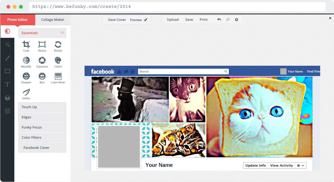
What I inherited
The 2014 product I inherited was a light-theme UI with a basic left panel — tool names listed as plain text links, no grouping, no visual hierarchy. The collage maker and photo editor already felt like two different products. No one owned the design holistically.
My first redesign2014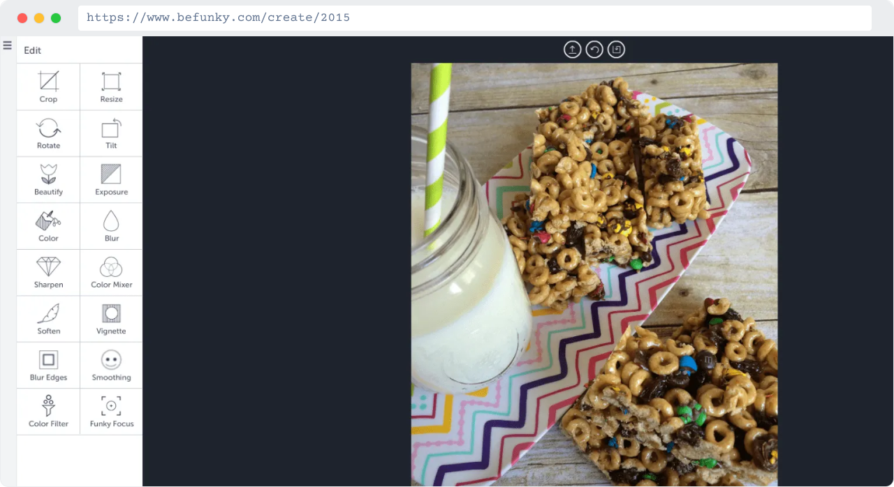
What I learned
My first move in 2015 was to introduce a dark canvas — shifting the product's visual focus to the user's work rather than the UI chrome around it. But the panel structure was still too flat. No grouping, no hierarchy, no way to scan what was available. I knew the structure itself had to change next.
↳
The key insight
The 2014 product I inherited was hiding its own value. Support tickets weren't asking for new features — they were asking to find the ones that already existed. That became my brief from day one.
V1 revealed the problem → V2 fixed the structureThe transition
2017 – 2019Before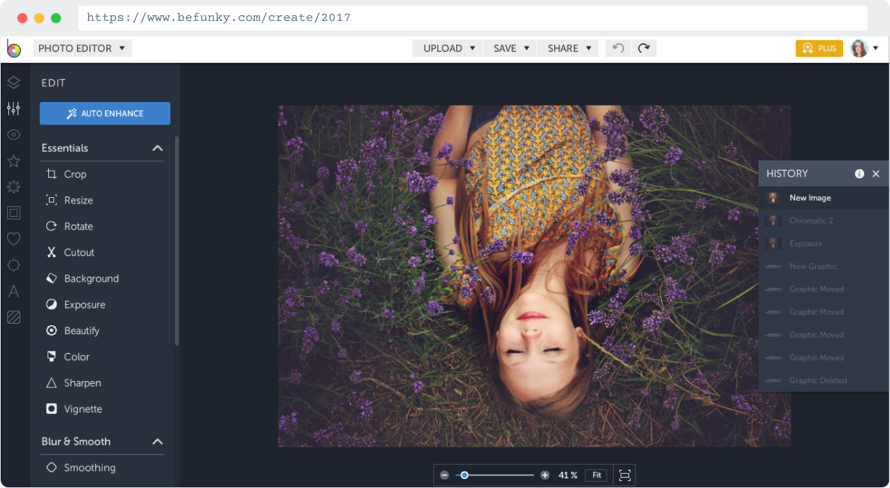
after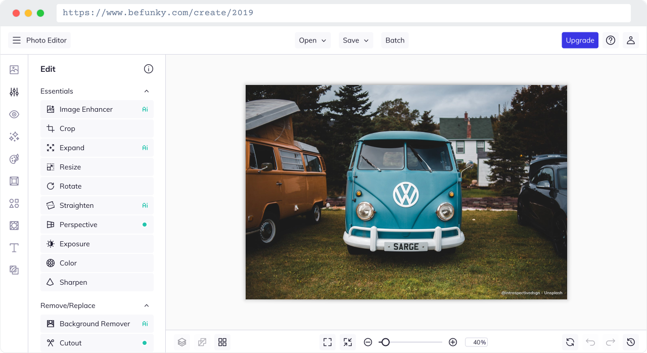
1
2
3
2017The decision
By 2017 I introduced a proper persistent panel with clear section labels — "Essentials", "Blur & Smooth" — and expandable categories. Tools had icons alongside labels for the first time. The 2019 version refined this further: tighter grouping, a cleaner top bar reduced to just Open / Save / Upgrade, and the full Remove/Replace category emerged as its own section.
2017The constraint
I couldn't just flip a switch. Millions of users had learned the old system. I introduced the persistent panel gradually — keeping familiar touchpoints while phasing in the new structure. The goal was zero surprise, not zero change.
Persistent left panel across all three editors
The same structural shell — icon nav on the far left, expandable tool panel beside it — applied consistently to Photo Editor, Collage Maker, and Graphic Designer. Users switching between tools now recognized the layout immediately.
Expanded to iOS and Android for the first time
Alongside the web redesign, I led the mobile expansion — bringing the full BeFunky experience to iOS and Android. Built on the same panel-first structure, this opened an entirely new acquisition surface and gave existing users the product on a new device.
First shared component vocabulary
For the first time, the three editors shared common components: the same icon style, the same slider pattern, the same confirm/cancel behavior. Small things — but they added up to a product that felt intentional rather than assembled.
V2 fixed the structure → V3 formalized the systemThe unified system
2020 – 2022Before V32020The shift
2020 was a refinement of 2019 — the same persistent panel structure, now with the dark theme fully applied across the canvas and panel together. 2021 brought the biggest surface shift: mobile. The iOS and Android app launched with a bottom nav, an AI Enhancer badge, and before/after preview — a completely new interaction model built on the same underlying design language.
Unified system2
2021The result
A dark theme unified the visual tone across every surface. Tools were grouped into semantic categories — users now had a mental model for the whole product, not just individual tools. And the system was stable enough that new features could be added without structural rework. It could grow.
1
3
Dark theme as unification strategy
The dark theme wasn't aesthetic — it was structural. A shared visual language across all three editors made the product feel cohesive for the first time. The canvas — the user's work — became the brightest thing on screen. Everything else served it.
Semantic tool grouping addressed the original complaint
Essentials, Remove/Replace, Color Enhancements, Detail Enhancements. Grouping gave users a mental model — not just a list. The support ticket pattern that started this whole journey ("I can't find the tool") was finally, structurally solved.
A system that absorbed growth without rebuilding
New tools and features plugged into existing panel slots without structural changes. That's the measure of a real design system — not how it looks on launch day, but whether it can absorb the next two years of product decisions without falling apart.
04. impactWhat the work delivered
✅ The original complaint was fixed
Support tickets asking "where did my tool go?" and "why does everything look different in the other editor?" — the patterns that started all of this — reduced after the persistent panel and unified navigation shipped in V2 and V3.
✅ The product could grow without me rebuilding it
By V3, the design system was stable enough that new features plugged in without structural rework. As the sole designer, that was the most important thing I could build — a system that didn't require me to redesign every time the product expanded.
✅ Mobile opened a new surface at scale
Taking BeFunky to iOS and Android for the first time wasn't a UX project, it was a business move. A new acquisition channel, a new retention surface, and a 4.7-star rating that reflected the quality of the experience I built.
✅ More tools meant more reasons to upgrade
On a freemium model, feature depth is a retention and conversion lever. Each new tool added to the system gave users more reasons to stay, return, and eventually pay. The design system made it possible to keep shipping tools without UX debt accumulating.
↗ A note on metrics: This work predates the industry's shift toward tying design directly to revenue data. The impact is measured in scale, system quality, platform expansion, and product coherence — the right frame for foundational design work at a startup where one designer owned the entire product surface.