
Milk Stork · B2B SaaS · Benefits reportingOne system, so a team of one could design like a team of ten.
As the only designer, every inconsistency was mine to fix by hand. I built a component library with every variant, size and state defined, so product, marketing and engineering could ship consistent UI without waiting on me.
My roleSole designer: audit, architecture, components, documentation
TeamHead of Product, 3 engineers, CSM, Head of Growth
Timeline2024-2025
UsersHR and benefits admins at employer clients
30+
employer organizations using the dashboard
35%
fewer manual reporting requests to support
20%
increase in program utilization through visibility
1,000+
shipments a month made visible to HR
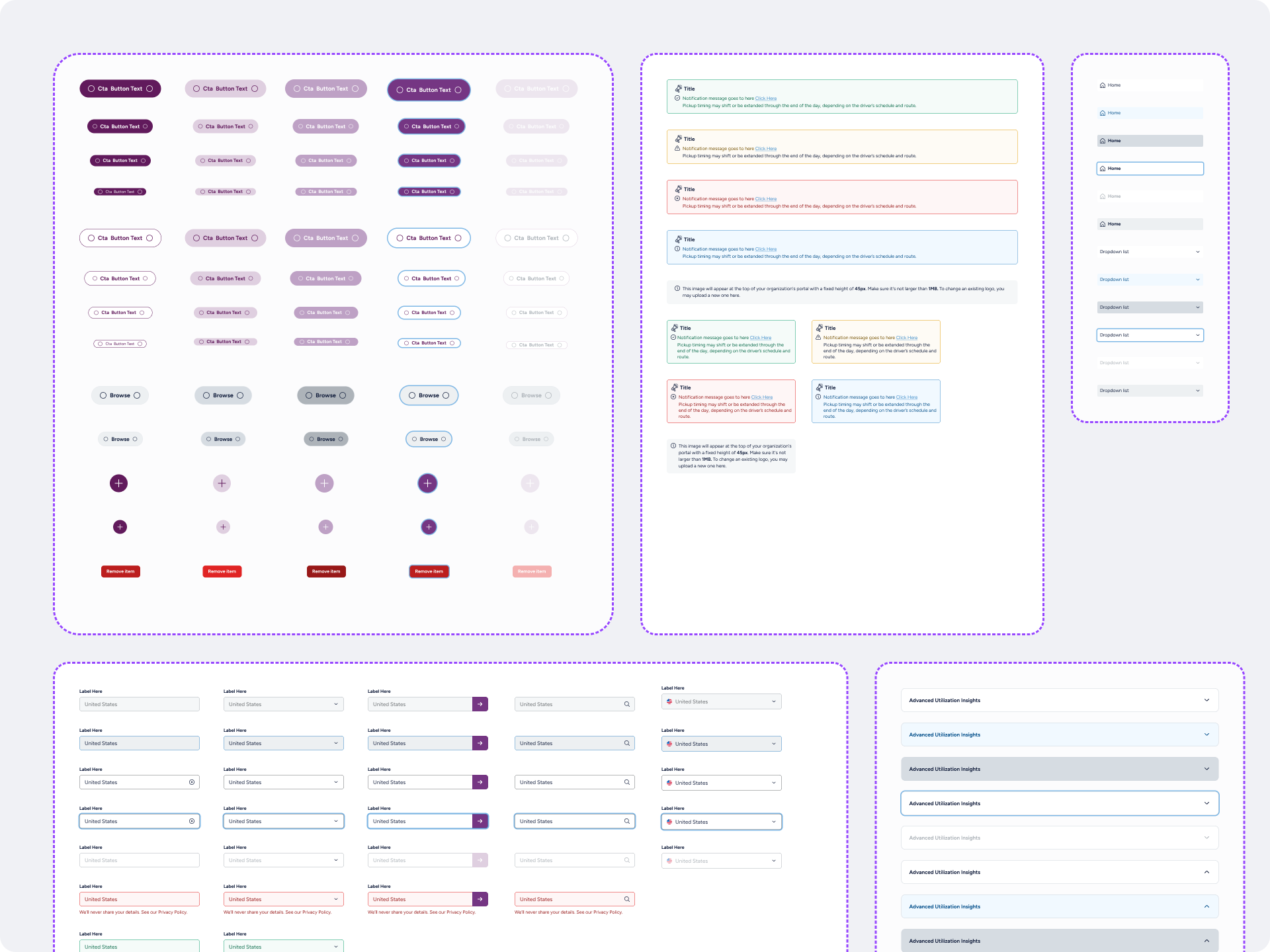
01 — Problem02 — ApproachEvery new screen reinvented the button.
Rather than a full redesign, I audited the existing library, consolidated duplicates, and prioritized the most frequently used components.
Visual drift
The same action looked different from screen to screen, which eroded trust in the brand.
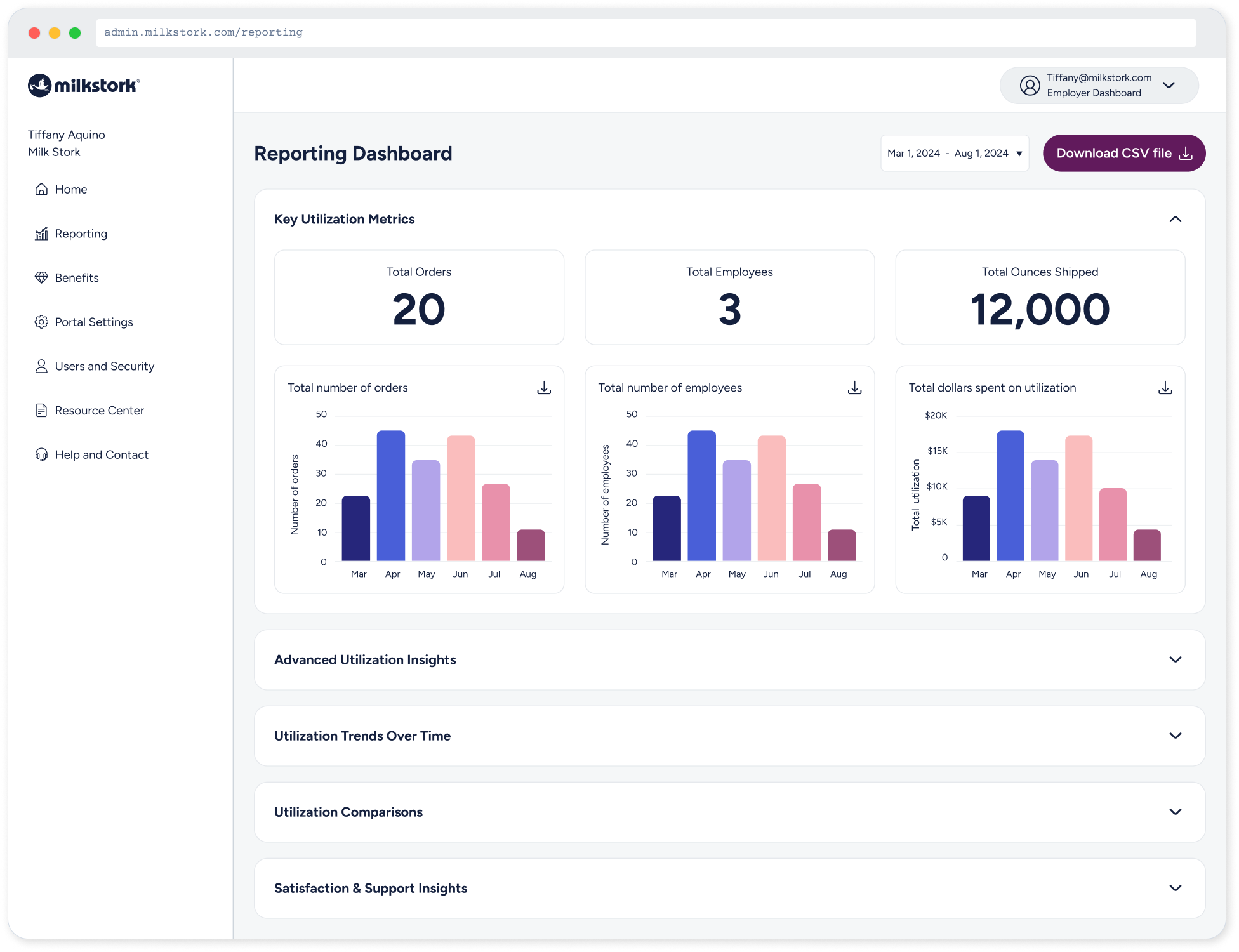
Decision 3A bottleneck of one
Without shared building blocks, every UI question came back to me.
Audit first, then build the smallest system that covers the most ground.
I audited the component library, removed redundancies, consolidated duplicates, and prioritized commonly used elements. This incremental approach created a more consistent, scalable foundation with minimal workflow disruption.
Audit
Screenshot and tag every UI pattern across product and marketing.
Foundations
Color, type, spacing and radius as tokens shared with code.
03Core components
Buttons, inputs and cards first, with every state and size.
04 — Impact04Document & adopt
Usage guidelines in Figma, paired with engineering on rollout.
03 — Key decisionsDecision 2A system only works if people actually use it, so every choice favored clarity over completeness.
A clear action hierarchy
Primary, secondary, tertiary and icon-only variants map to how important an action is, so every screen has one obvious next step.
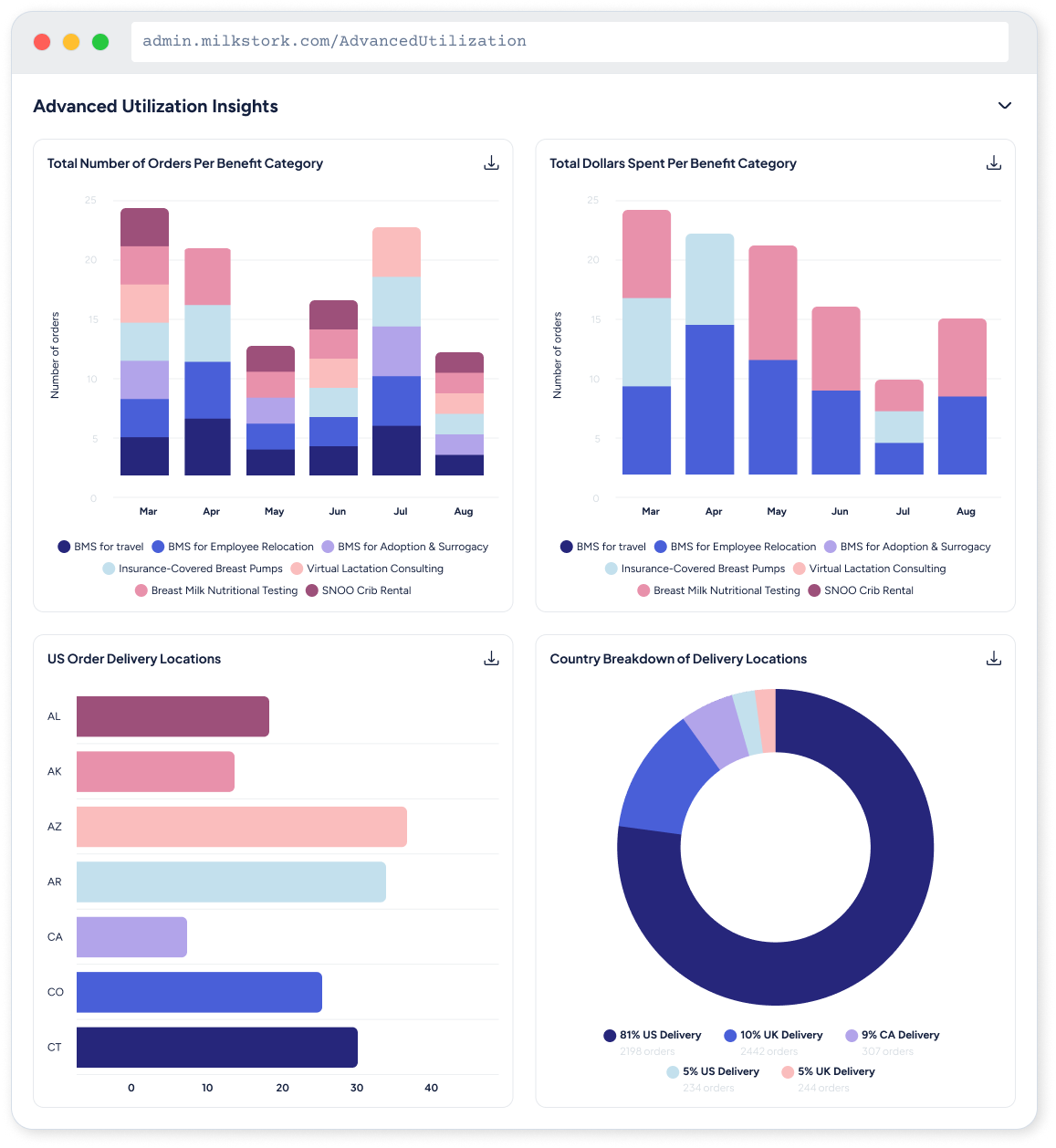
Slow handoff
Specs lived in one-off files, so engineers guessed at states and edge cases.
WHAT I LEARNEDDecision 1Every state designed, not implied
Default, hovered, pressed, focused and disabled are designed for every variant, so engineers never have to guess, and focus states meet accessibility from day one.
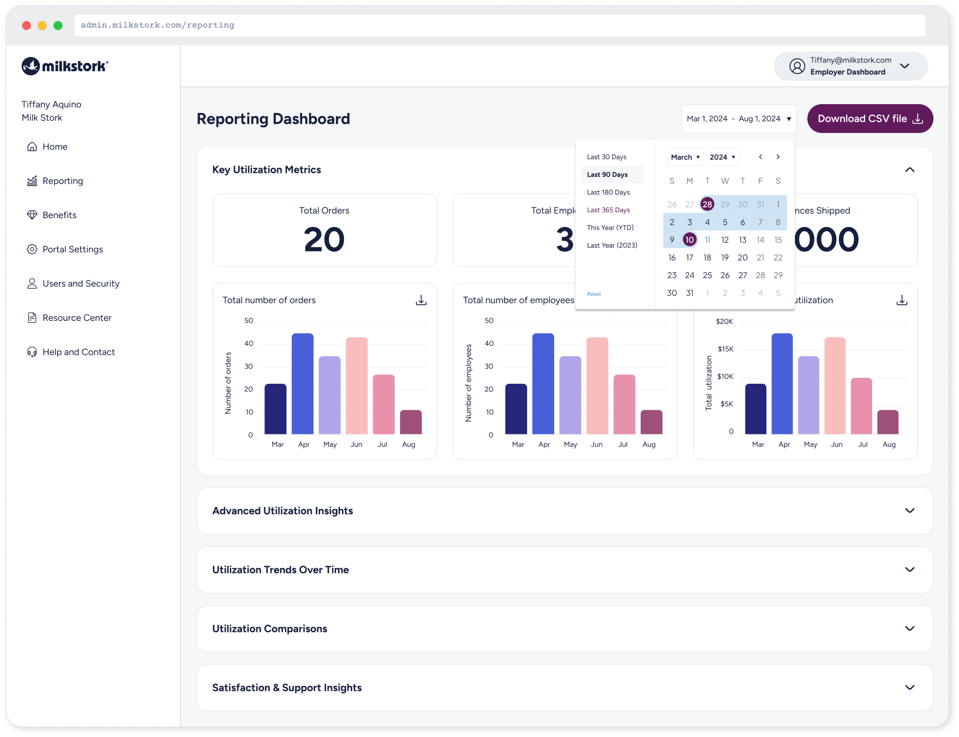
Tokens shared between Figma and code
Colors, type and spacing live as named tokens on both sides, so a brand change happens once instead of in every file.
Fewer pixel debates, faster builds and one brand across every surface.
[Describe adoption and results: how many surfaces moved to the system, how handoff time changed, and what engineering said. Add how each number was measured.]
The best data visualization isn’t the most impressive one — it’s the one that makes the right decision obvious.