Building BeFunky’s Design System for Consistency and Scalability
Quick Wins
50 percent reduction in design and development time
30 percent increase in user satisfaction
Unified design across web and mobile tools
Role
Design Director
I led the creation of BeFunky’s first design system, unifying fragmented UI across a fast-growing creative platform. I developed reusable foundations, introduced scalable patterns, and ensured seamless adoption across web and mobile.
Background and Goal
BeFunky’s rapid product growth had led to design fragmentation and inefficiencies. Each tool had evolved independently, resulting in inconsistent interactions and visuals. The goal was to:
Establish a cohesive design language across all tools
Reduce duplication in design and development work
Build a scalable system to support future features and platforms
Solutions
Audited existing UI across products to identify inconsistencies in structure, spacing, and interaction
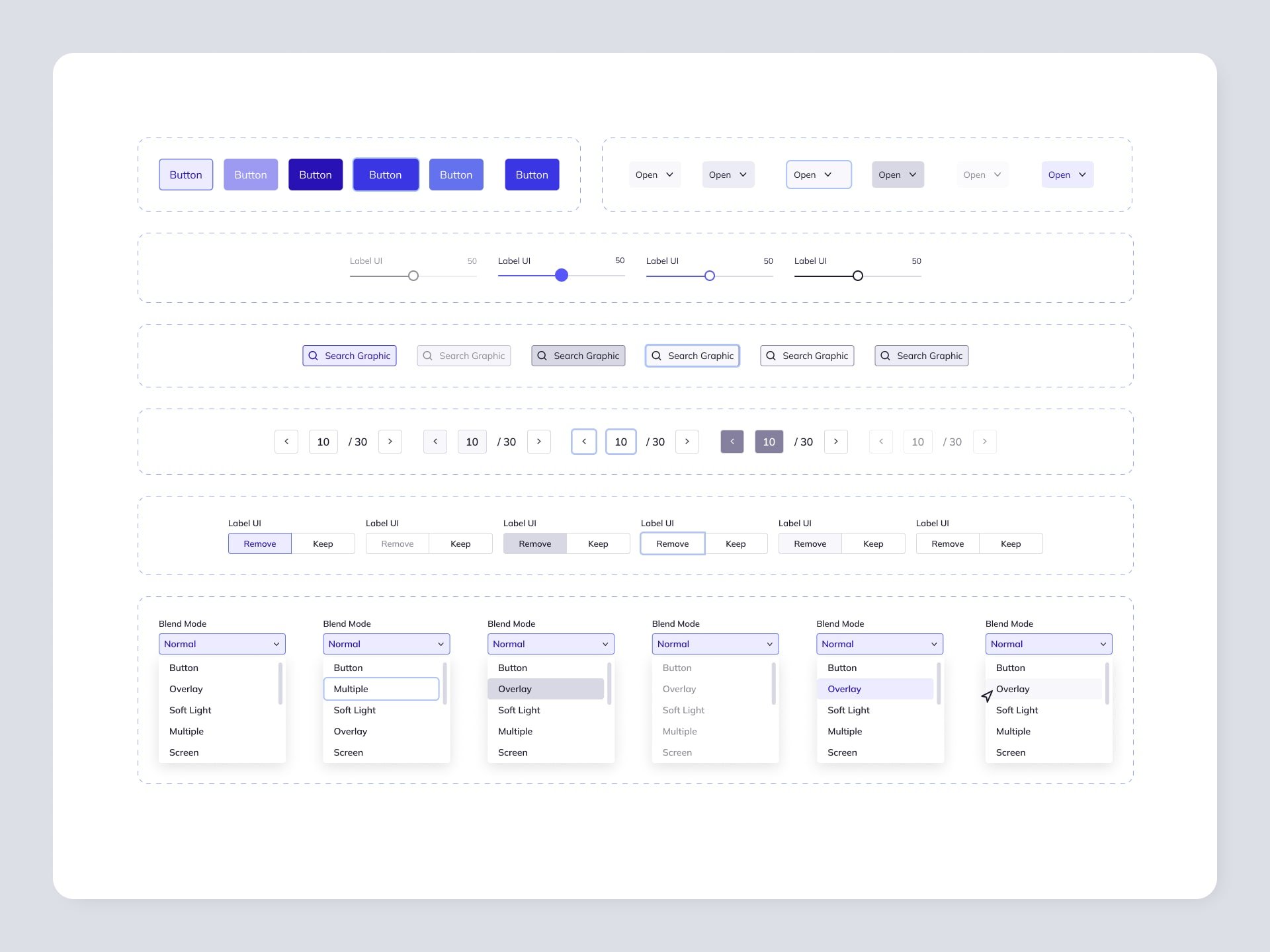
Developed a modular design framework built on custom tokens for color, typography, and spacing
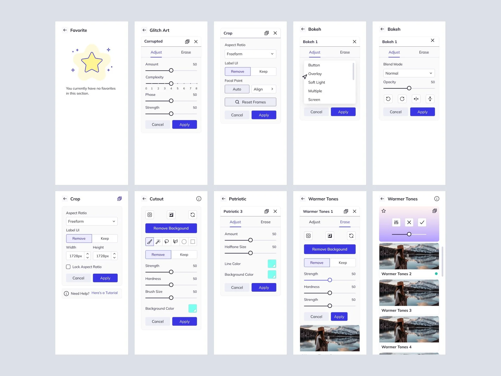
Created foundational and product-specific components in Figma
Centralized documentation with clear usage, accessibility, and interaction guidelines
Rolled out improvements in phases, starting with high-traffic areas like navigation and core actions
Integrated shared tokens and styles across web and mobile for consistency
Onboarded cross-functional teams with hands-on documentation and live workshops
Research and Insights
Detailed UI audit surfaced key pain points in navigation, toolbars, and modals
User feedback revealed confusion when switching between tools with inconsistent layouts
Internal interviews uncovered inefficiencies from repeated component creation
Design Execution
Developed core components such as buttons, sliders, and modals, plus product-specific elements like drag-and-drop zones
Built a single source of truth in Figma with reusable design primitives
Prioritized implementation in the Photo Editor before expanding to Collage Maker and Graphic Designer
Ensured cross-platform consistency by integrating design tokens into both web and mobile development
Established a long-term governance model to maintain and evolve the system


Outcomes
BeFunky’s first unified design system streamlined development, improved task completion, and scaled effortlessly across web and mobile—reducing bugs, speeding up releases, and enabling smoother onboarding.
Timeline: 9 months (2020–2021)
Stakeholders: CEO, Lead Engineer, 3 Frontend Engineers, 1 Visual Designer
Figma: Share upon request during interview or walkthrough