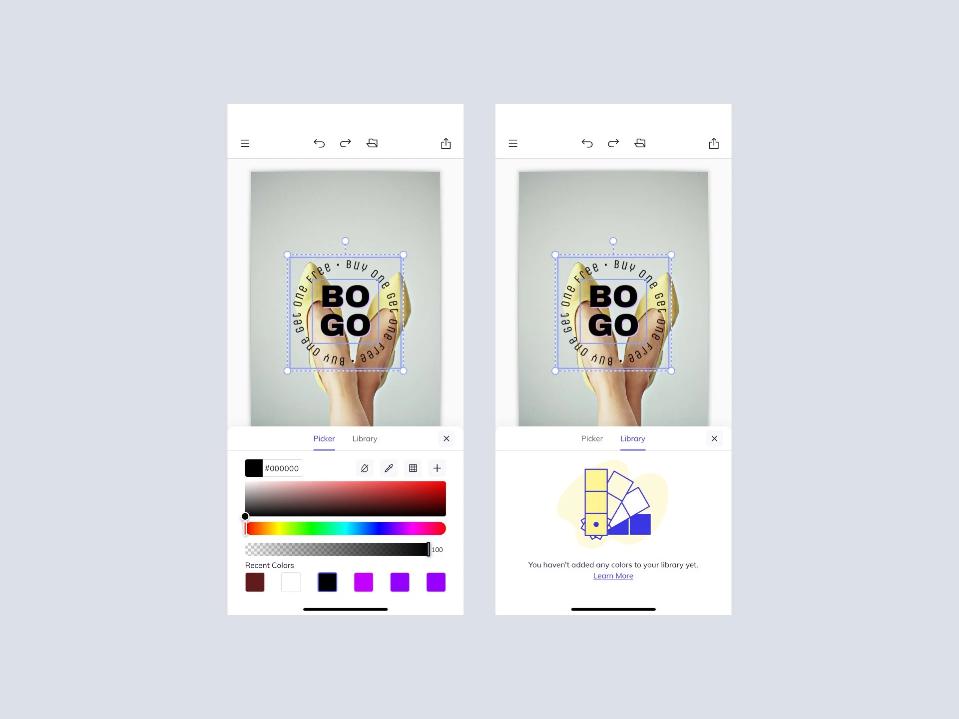
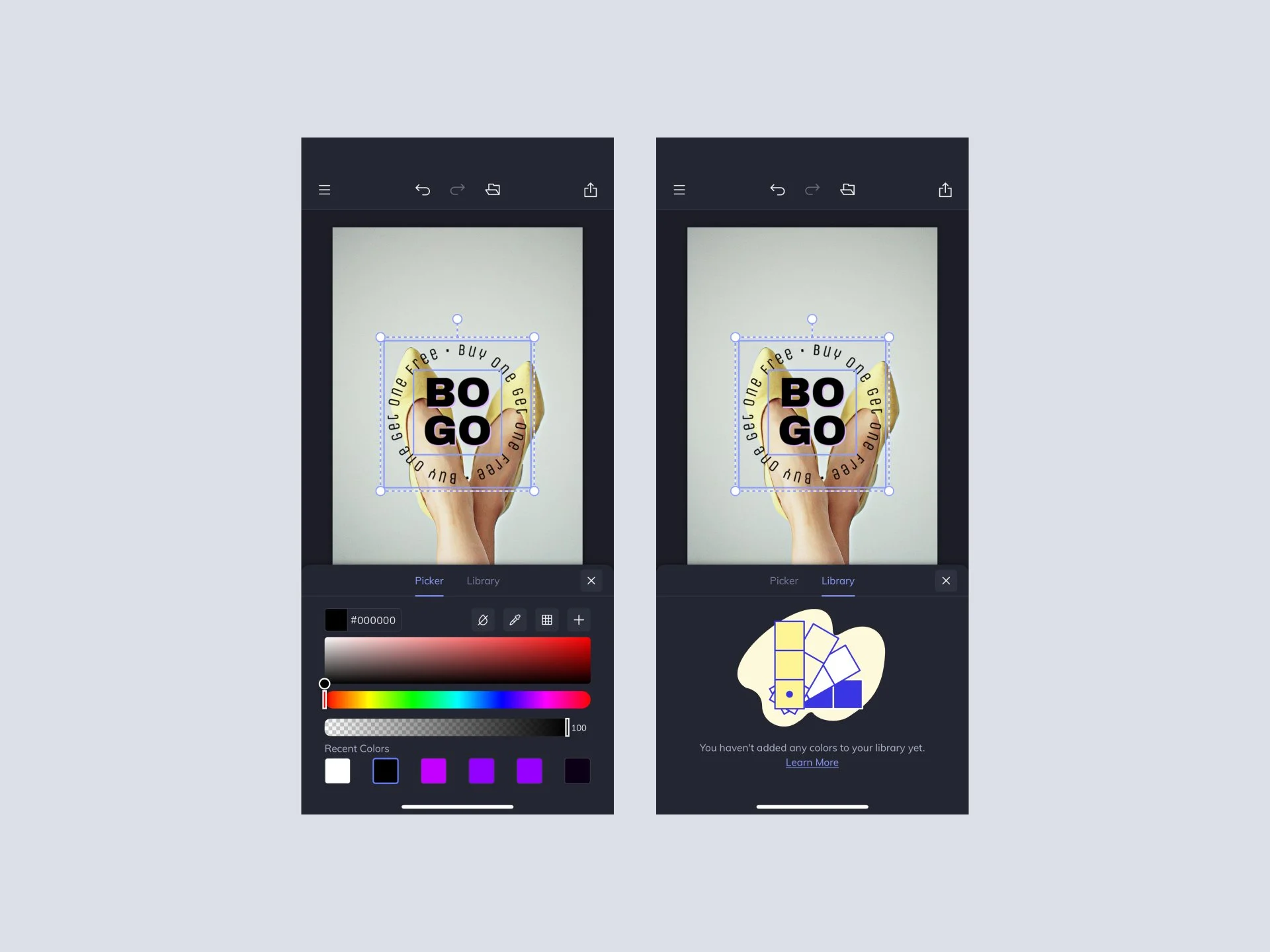
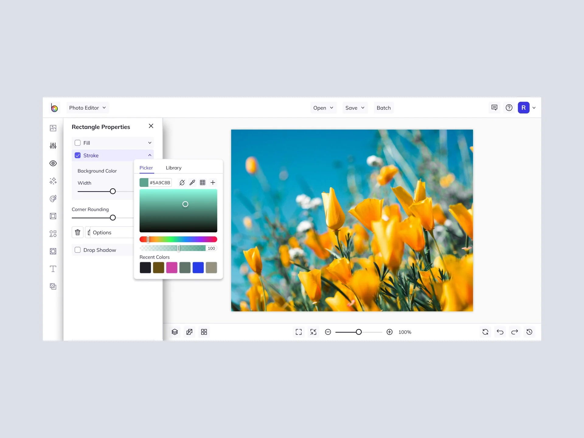
Smarter Colors, Smoother Editing: BeFunky’s New Color Picker
Quick Wins
+22.1% successful color selections across tools
−35.6% fewer support tickets tagged “color selection”
1.6× more editing actions per mobile session
Component reused in 6+ tools within 2 months
Role
Design Director – IC Lead for this project
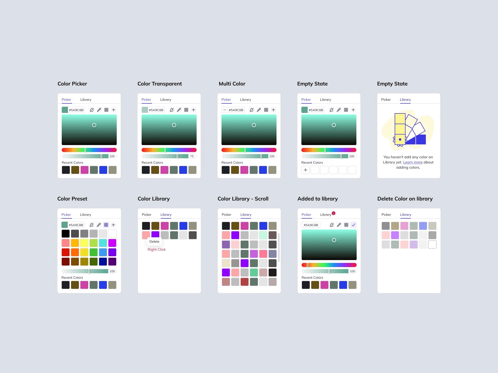
Although I typically operate at the design director level, I took on a fully hands-on IC role for this redesign. I led UX strategy, component design, and implementation across desktop and mobile, collaborating closely with product, engineering, and support to modernize a core interface.
Background
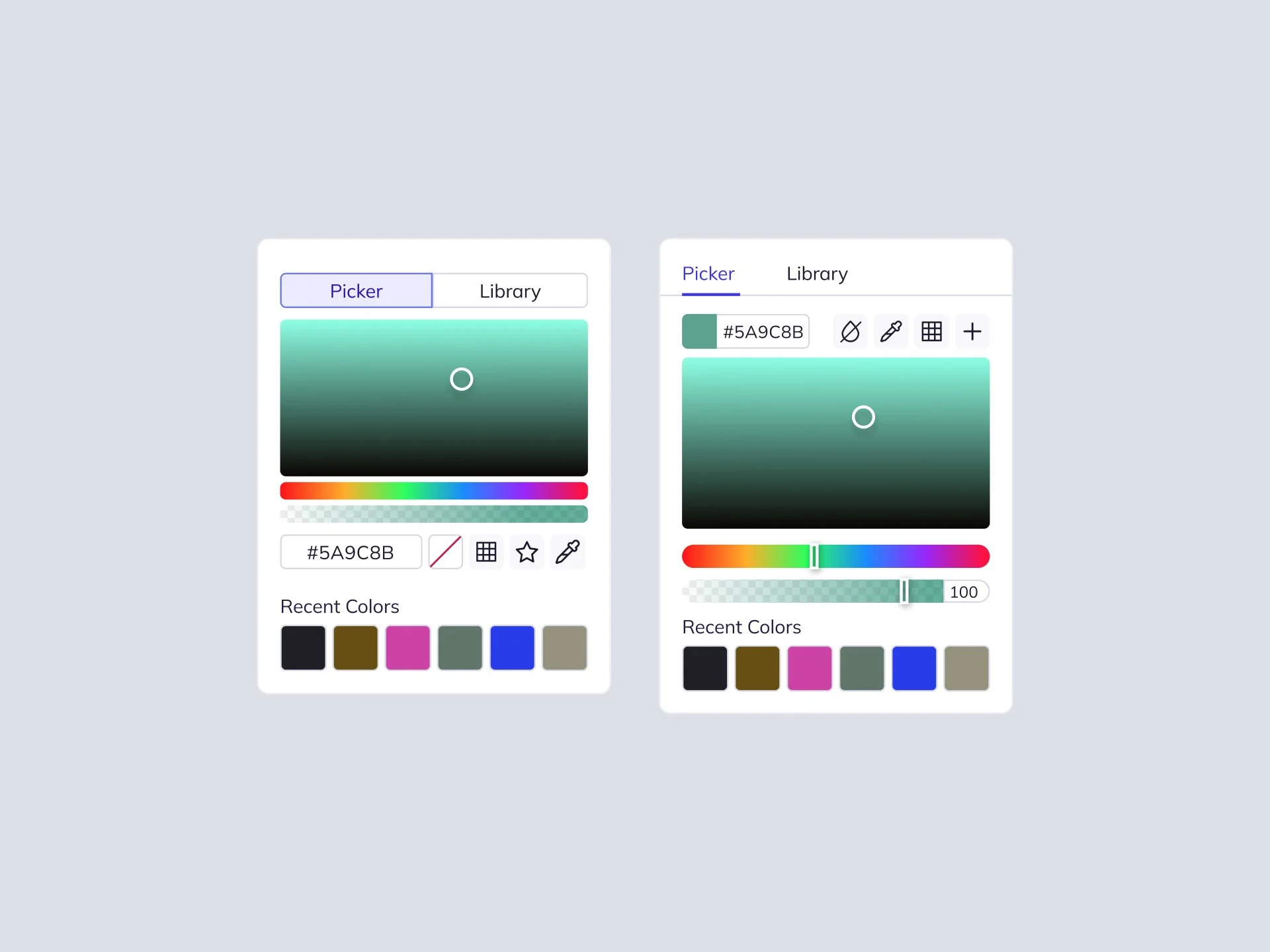
BeFunky’s existing color picker was showing its age—clunky interactions, inconsistent behavior, and mobile friction. Support teams reported frequent user complaints.
The goal:
Improve usability and accessibility across platforms
Make color choices faster, clearer, and more intuitive
Reduce support friction
Build a scalable, system-friendly component
Research & Insights
Session replays showed users hovering repeatedly before committing to a color.
Mixpanel funnels revealed a drop-off of 18% when switching color types (Fill → Stroke).
Interviews uncovered a desire for recent colors and easier custom hex input.
Results
Users picked colors with confidence. Mobile edits jumped, support tickets dropped, and the new picker became a fast-scaling component in our design system.
Timeline: 10 weeks (dual-platform sprints)
Stakeholders: CEO, Director of Products, and Lead Frontend Engineer
Web App: https://dub.sh/VEtqERD