Implementing Dark Mode in a Scalable Design System
Quick Wins
30 percent faster implementation using token-based theming
Over 80 percent user satisfaction with dark mode
Built-in support for future dark mode components and features
Role
Design Director - I led the integration of dark mode into BeFunky’s design system—creating a scalable, accessible theming framework that supported rapid implementation and enhanced user experience across the platform.
Background and Goal
User demand for dark mode was rising, but our existing design system wasn’t equipped to handle theme switching. The goal was to:
Introduce dark mode without duplicating component work
Ensure accessibility and consistency across themes
Build a scalable solution for future growth
Solutions
Conducted user research to prioritize use cases for dark mode
Audited existing UI for contrast and theme limitations
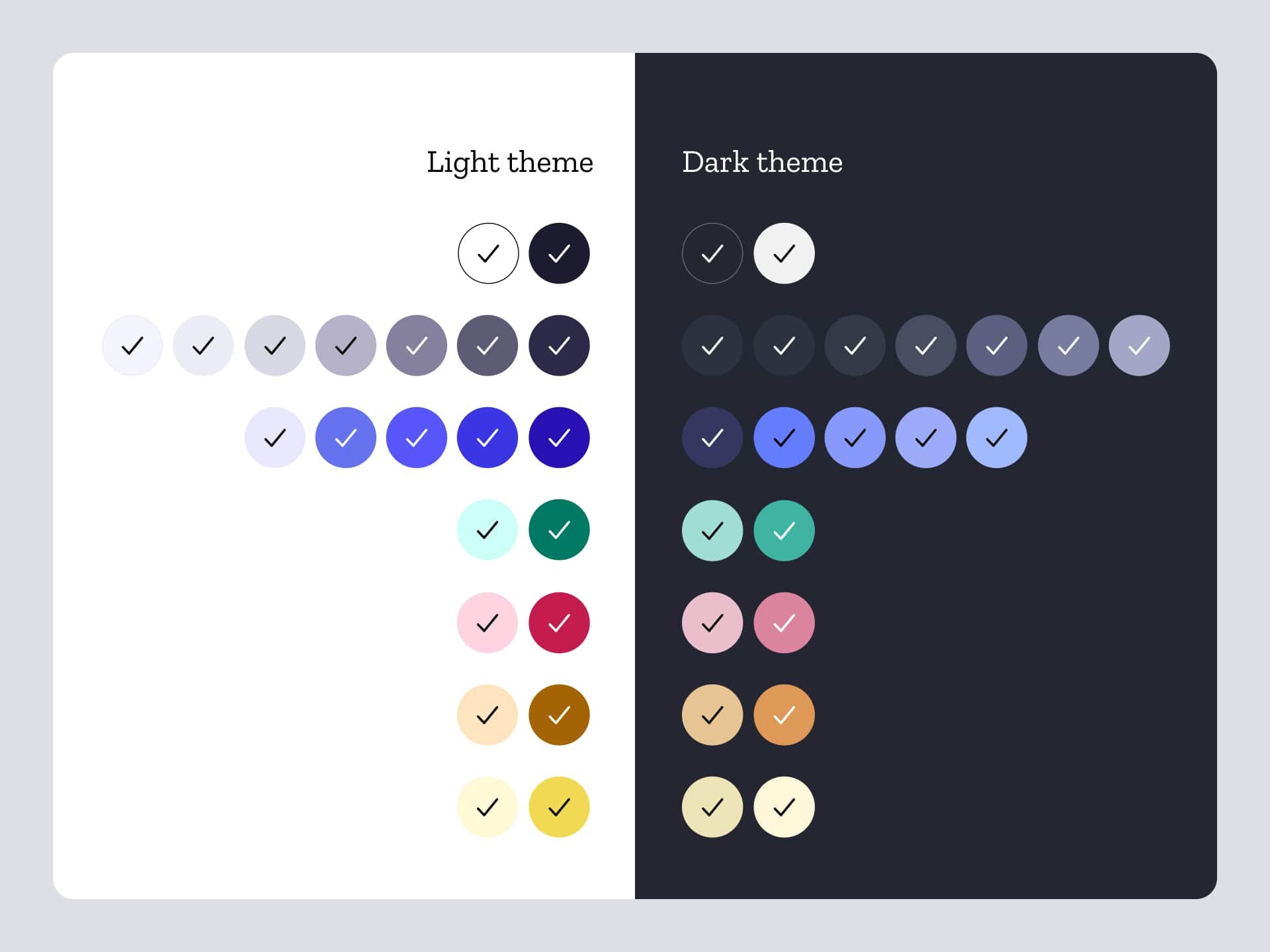
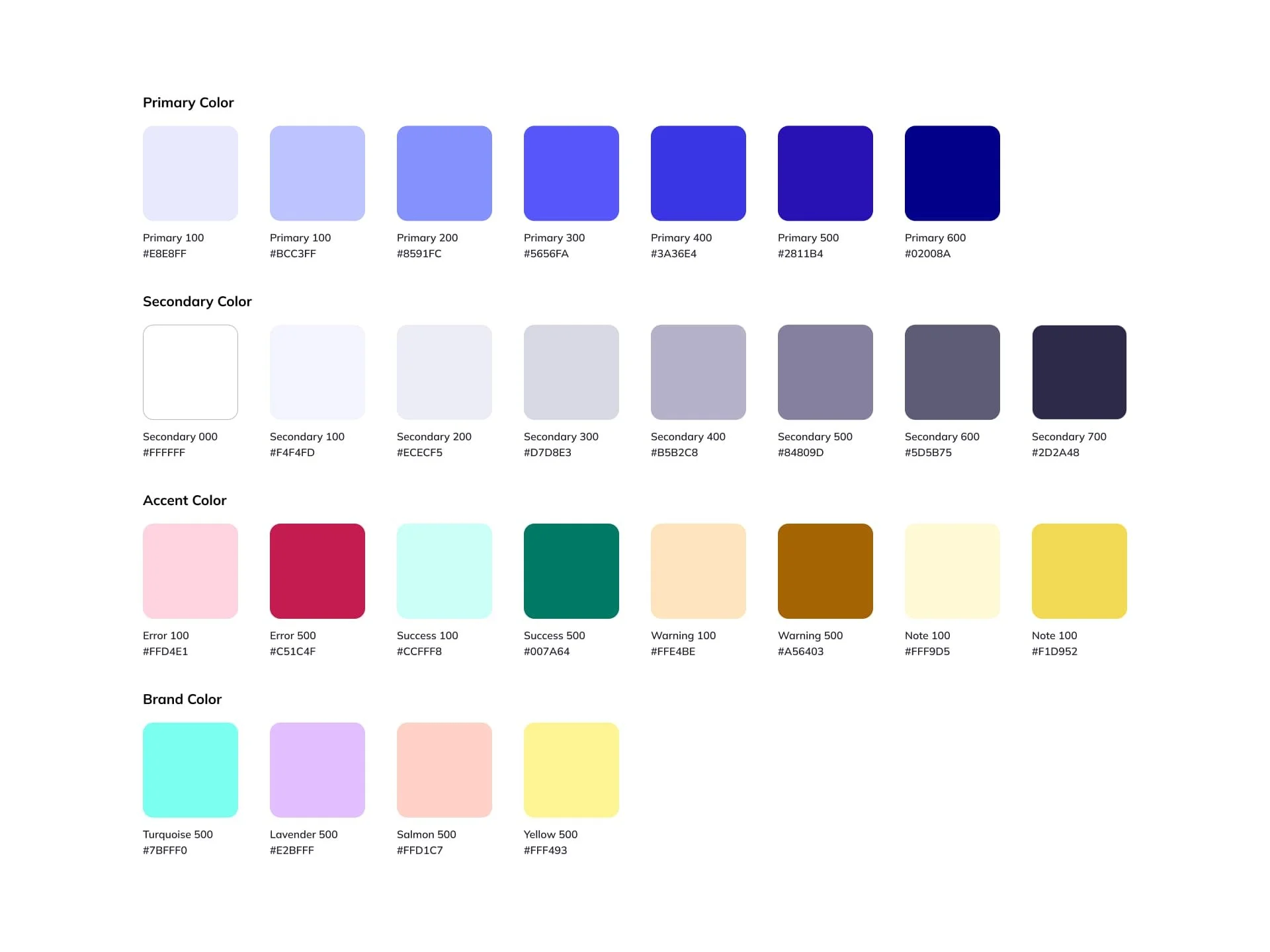
Created a token-based theming system for color, elevation, and interaction states
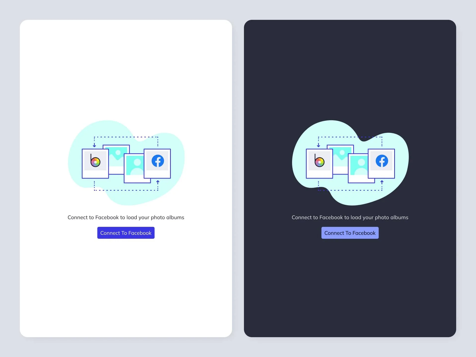
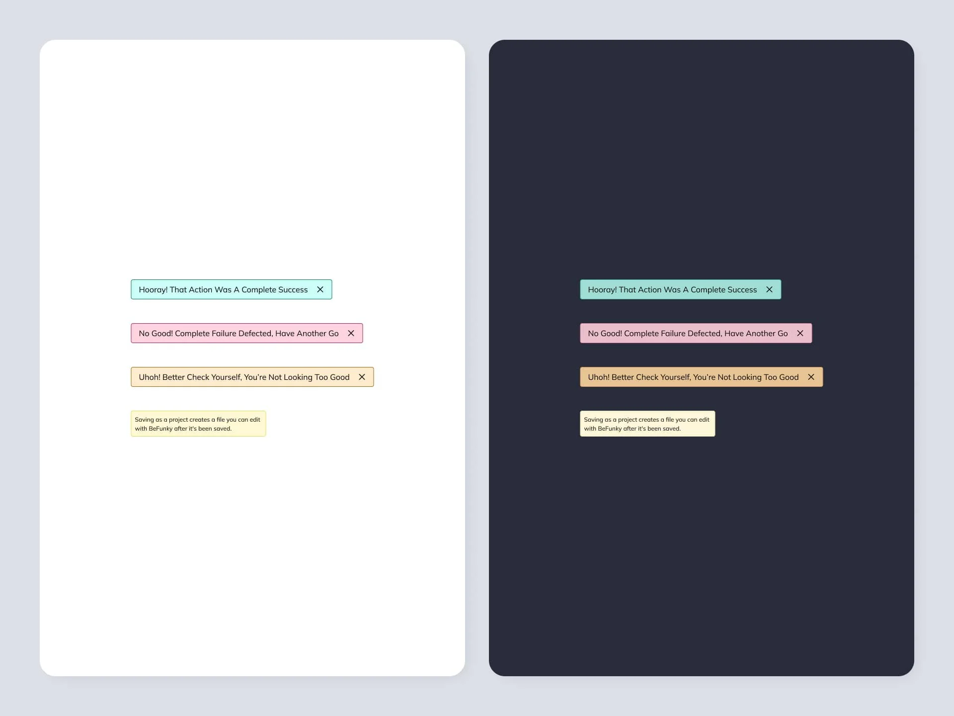
Updated all key components to adapt cleanly across light and dark modes
Integrated tokens into the codebase using CSS variables for efficient switching
Implemented and tested dark mode incrementally with feature flags
Research and Insights
Surveys and interviews showed strong user demand tied to comfort and visual fatigue
Key pain points included harsh background contrast and text legibility in low light
Audits revealed gaps in visual consistency and insufficient color contrast in the original system
Design Execution
Developed new tokens for core design properties: color, text, surface, shadows
Adapted key components including buttons, modals, forms, and overlays
Verified WCAG AA compliance across both themes
Created a global theming layer for seamless toggling and scalability
Tested across devices and screen types for consistent performance
Outcomes
Reduced component update time by 30% with tokenized styling
Over 80% of users preferred dark mode for extended use
Achieved full accessibility compliance in both light and dark themes
Built a future-proof system for theme flexibility across all new features
Timeline: 9 months (2020 to 2021)
Stakeholders: CEO, Lead Engineer, 3 Frontend Engineers, 1 Visual Designer





Outcomes
With a scalable system in place, BeFunky moved faster, ranked higher, and shipped better content—without compromising design or performance.
Site Link: BeFunky Photo Editor Features
Timeline: 4 months (design system + CMS integration)
Stakeholders: CEO, Director of Product, Content Manager, Lead Developer, Visual Designer