Smarter Navigation, Broader Reach: Redesigning Insurify’s Mega Menu
Quick Wins
+28% faster time-to-quote from homepage
+19% lift in mobile menu engagement
Expanded to support new verticals: Pet and Renters Insurance
Role
Design Manager – IC for this project
While leading broader design strategy, I took on a hands-on role for this high-impact navigation redesign. I owned UX research, interaction design, and cross-functional alignment—focused on making exploration easier and scaling our information architecture.
Background & Goal
As Insurify expanded into more insurance verticals, our legacy navigation fell short. Key products were hidden, user paths were unclear, and mobile performance lagged.
The goal:
Make it easy to discover and compare insurance types
Support Pet and Renters as new verticals
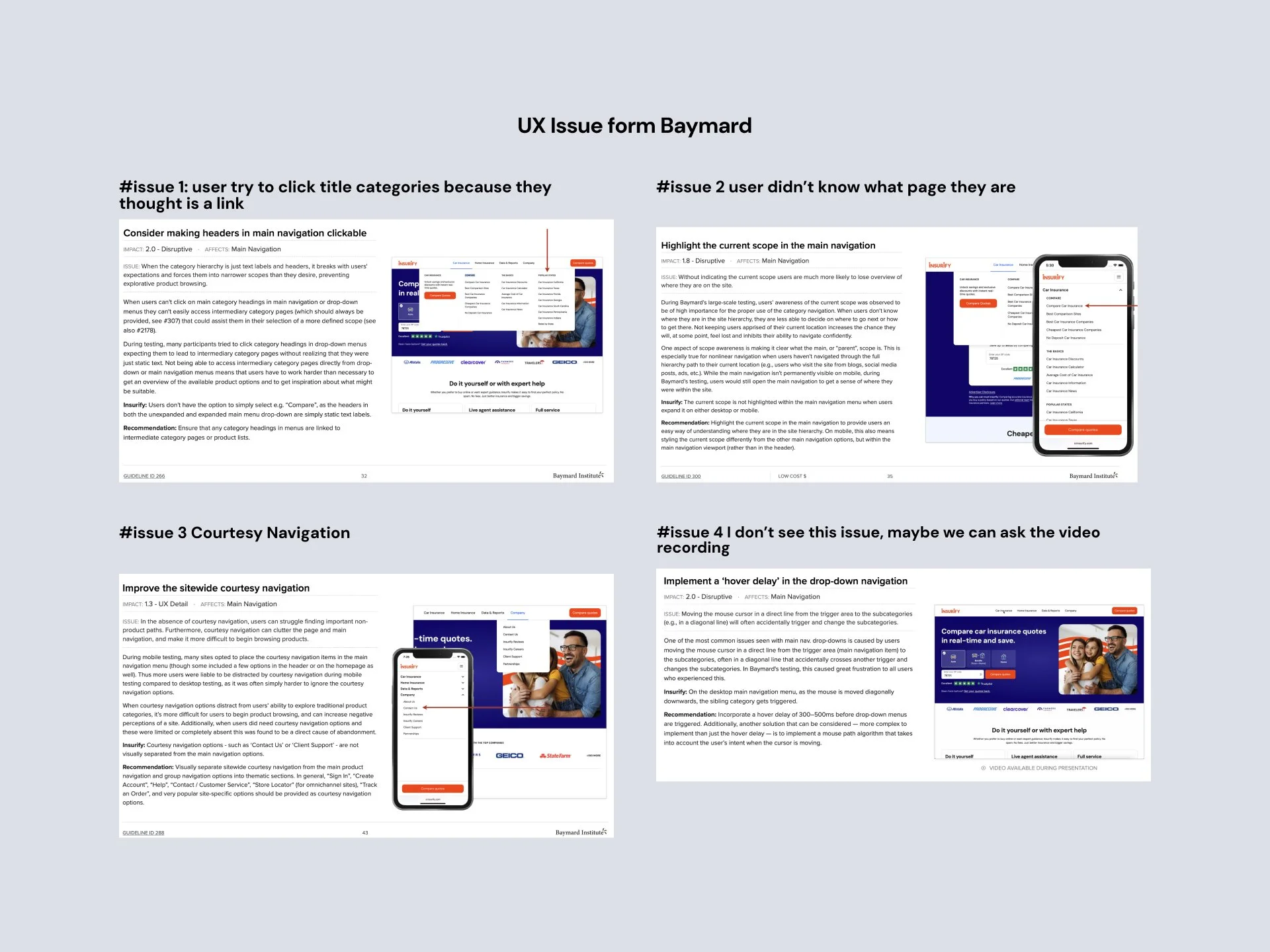
Improve mobile UX and align with Baymard Institute best practices
Research & Insights
✅ Baymard-Based UX Audit
Highlighted poor scannability, unclear link groupings
Found violations in tap targets and mobile usability patterns
✅ User Testing & Analytics
Heatmaps showed weak interaction on secondary nav
Interviews confirmed user confusion with category names and structure
Design Highlights
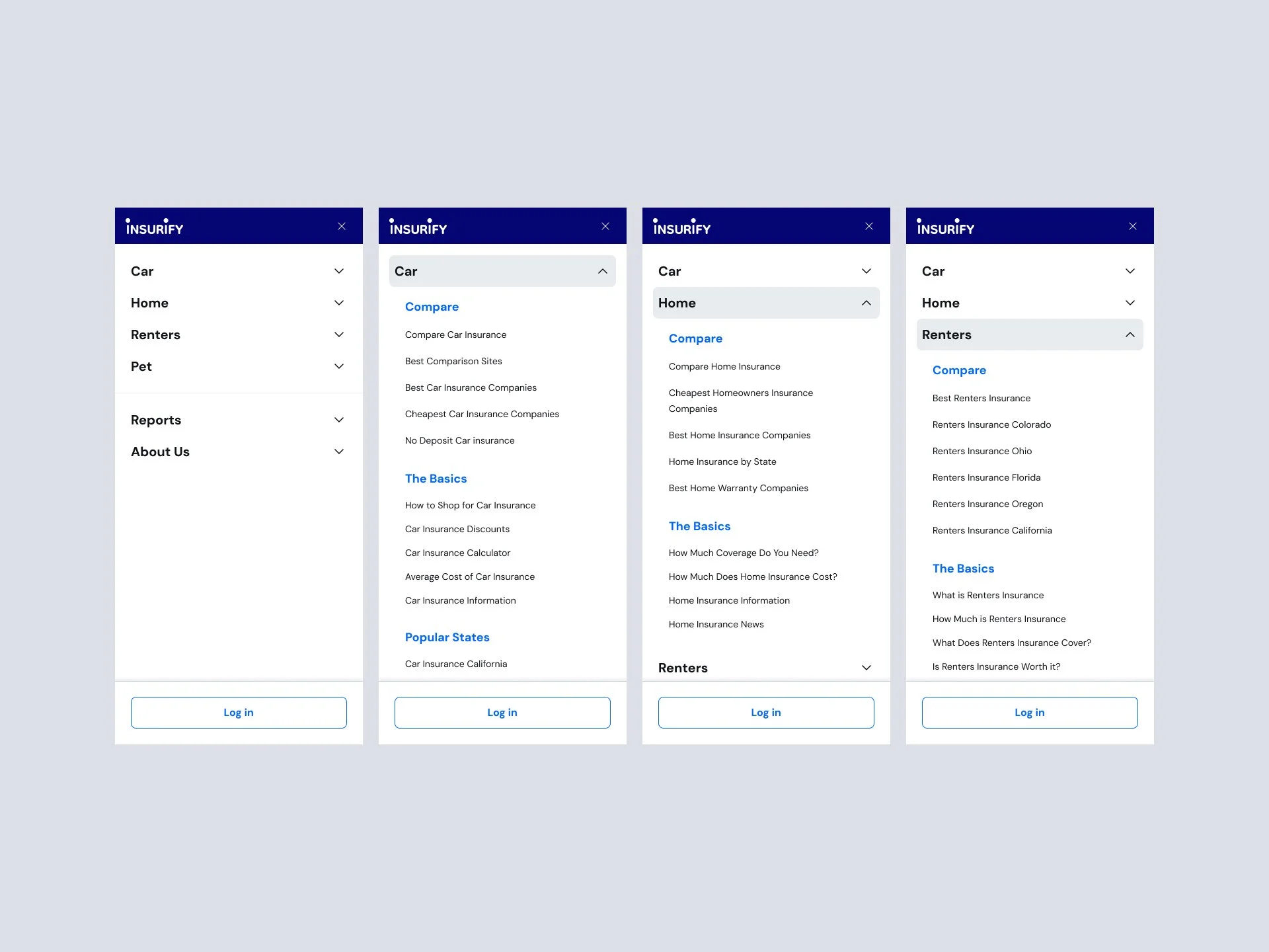
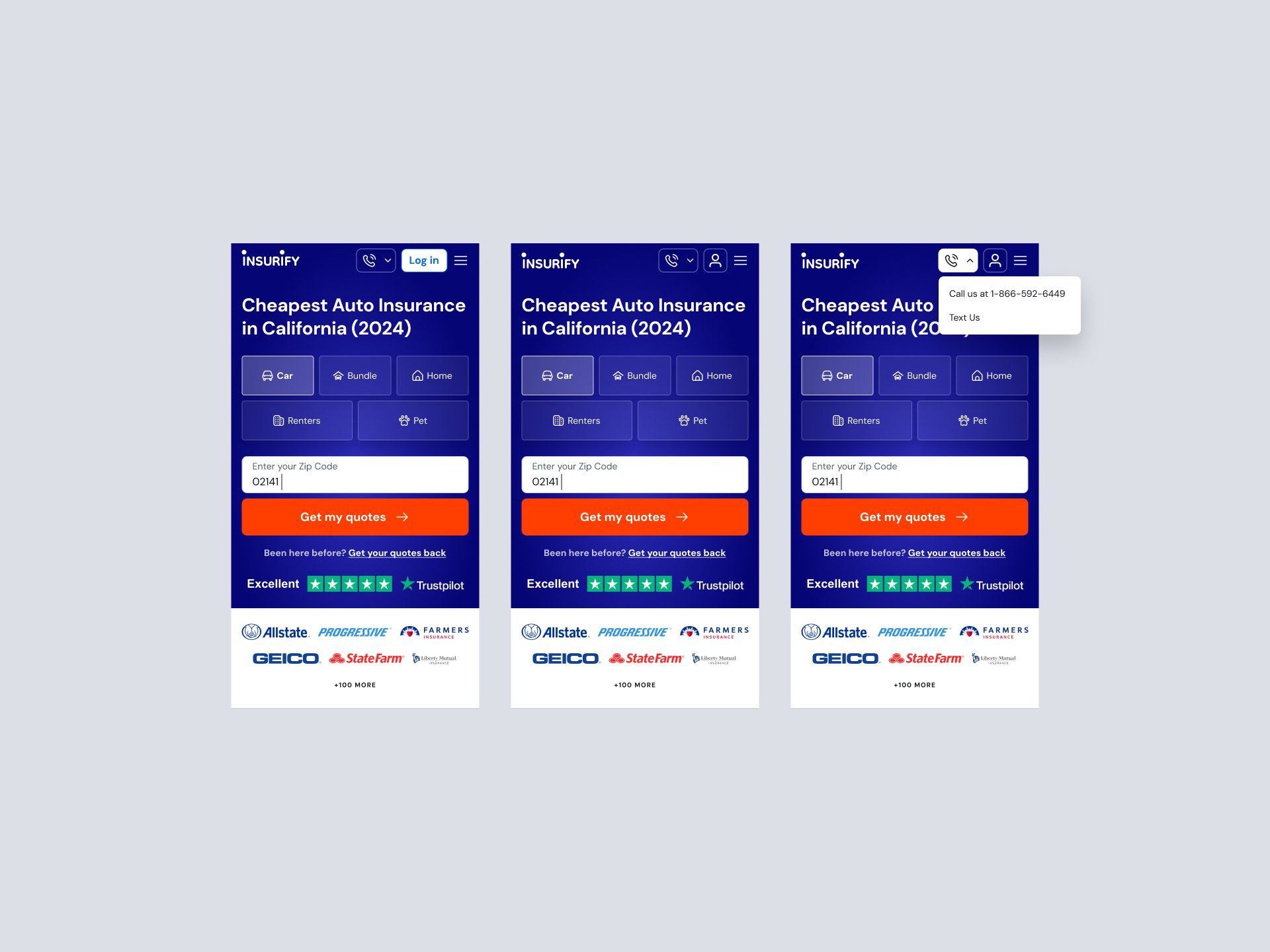
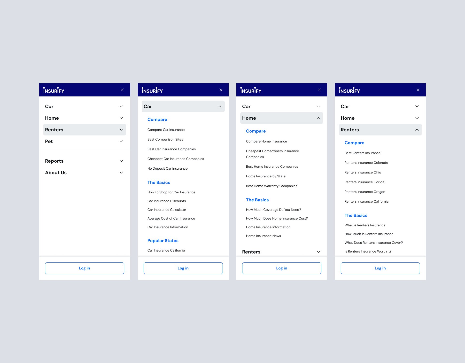
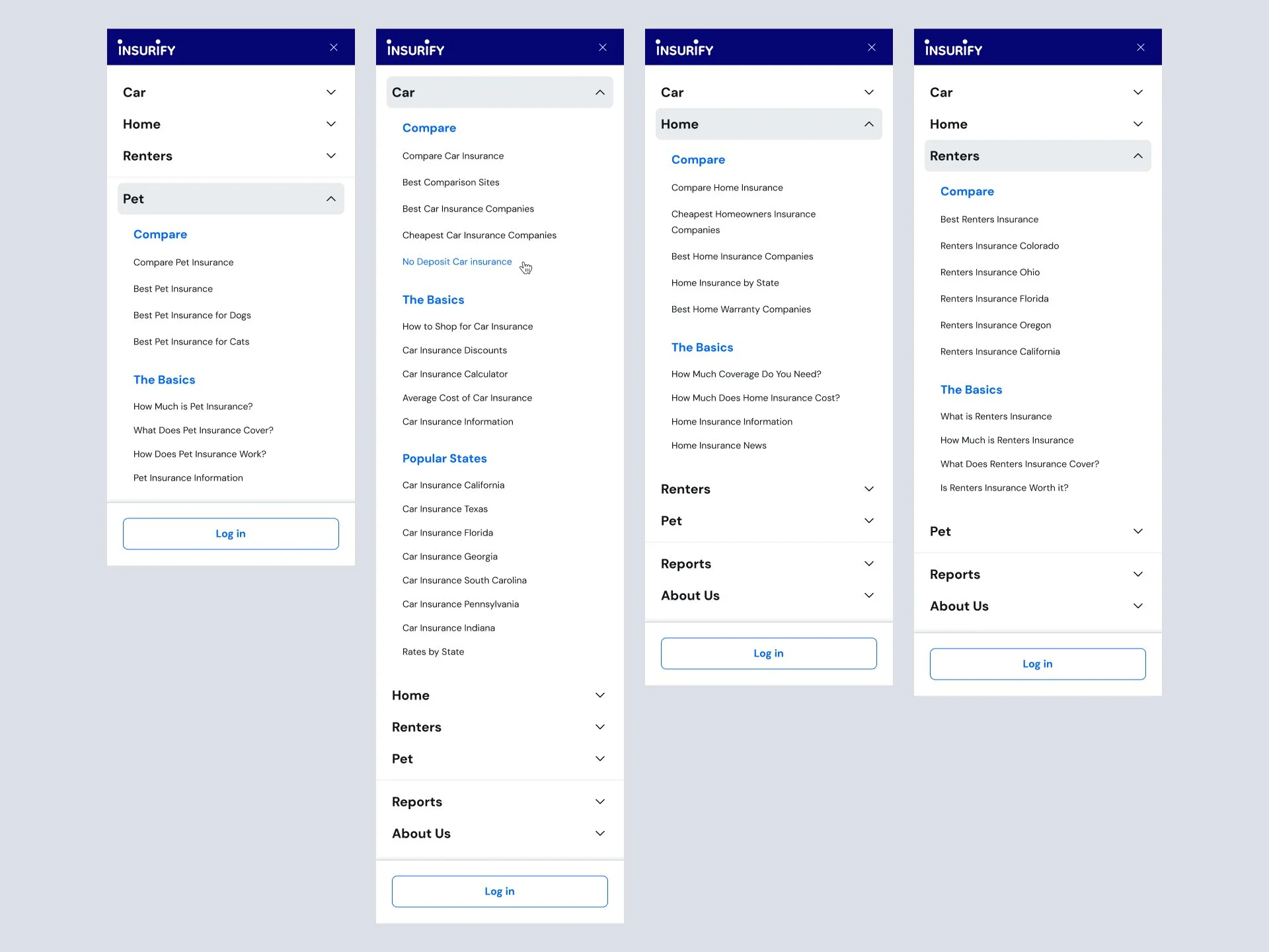
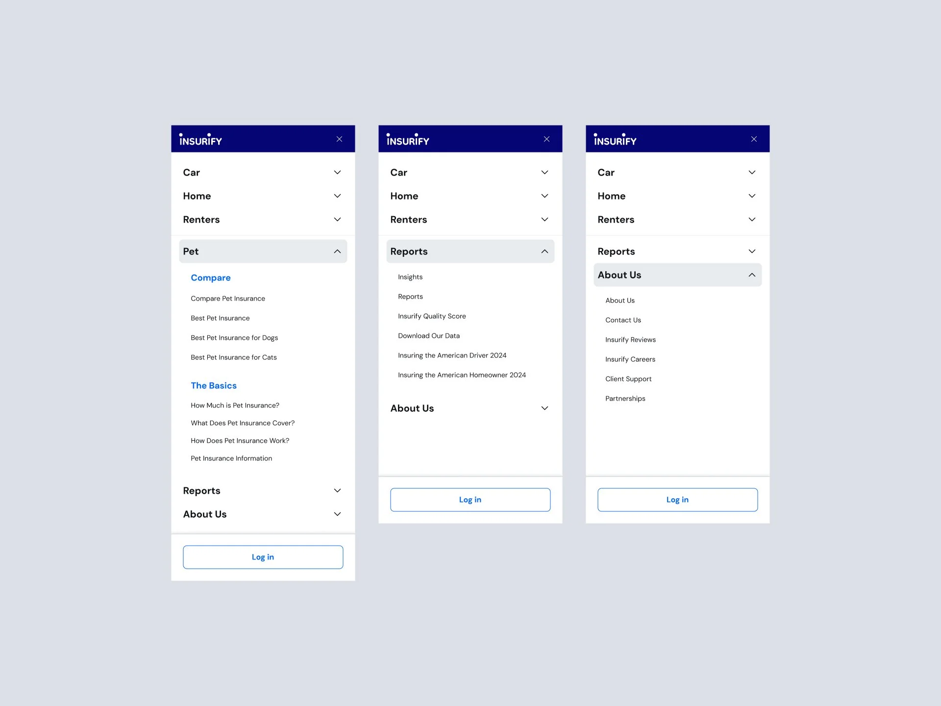
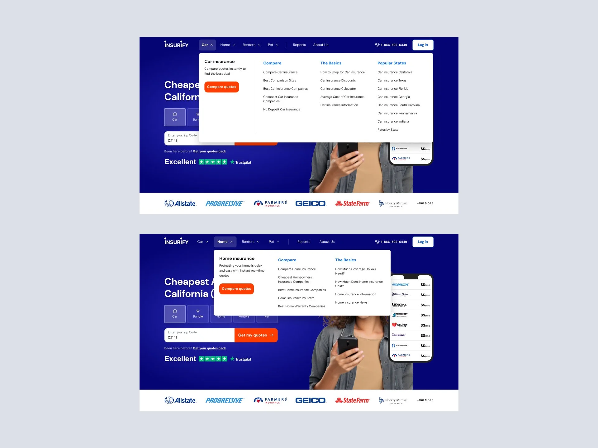
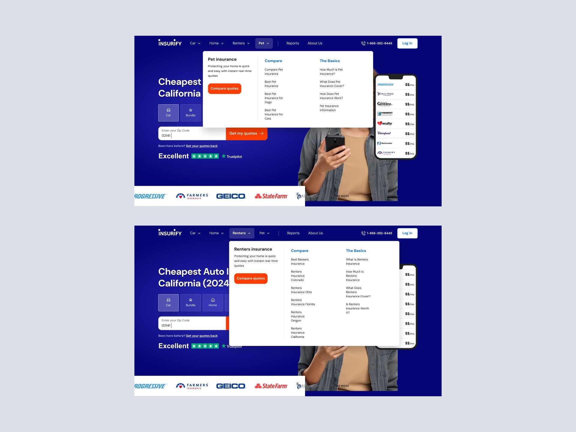
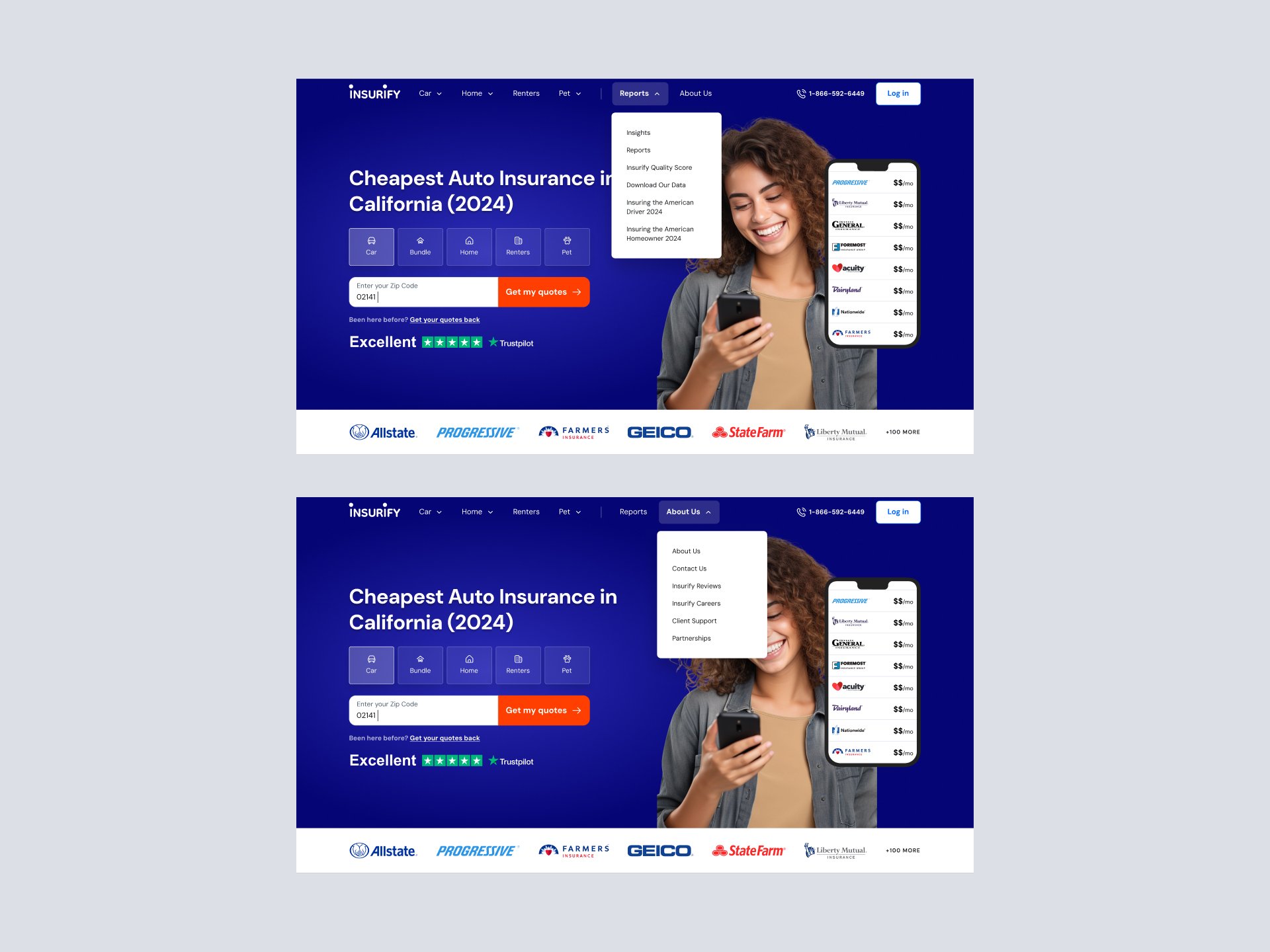
✅ Streamlined Mega Menu
Clear categories for Auto, Home, Pet, Renters
Icons and subtext for fast comprehension
✅ Mobile-First Redesign
Tap-friendly layout with collapsible sections
Persistent “Get a Quote” CTA for quick action
✅ Future-Proof Information Architecture
Modular system supports new verticals without redesign
Built for content flexibility and SEO alignment
Outcomes
Navigation went from fragmented to focused—helping users act faster, understand more, and discover all that Insurify offers.
Link: insurify.com
Timeline: 2 months (research, design, and rollout)
Stakeholders: VP of Audience, SEO Director, Engineer Lead, Director of Content