Data That Drives Decisions: Insurify’s Interactive Visualization Framework
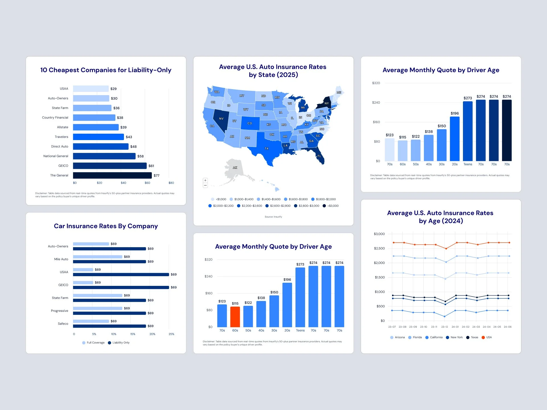
Quick Wins
+42.7% increase in time on page
Top 5 SEO performers across content pages
Zero dev needed for chart updates post-launch
Role
Design Manager – IC for this initiative
I led UX and visual design for Insurify’s interactive pricing trends experience. This included choosing the right data viz tool, designing for edge cases, and building a scalable system editorial teams could reuse.
Background & Goal
Auto insurance shoppers want clarity—not raw data dumps. We needed to turn rate trends into compelling visual stories that engaged users, performed on SEO, and fit into our existing CMS infrastructure.
The goal:
Create interactive, responsive visualizations
Fit within the Storyblok CMS for easy updates
Support repeatable content without more design lift
Research & Insights
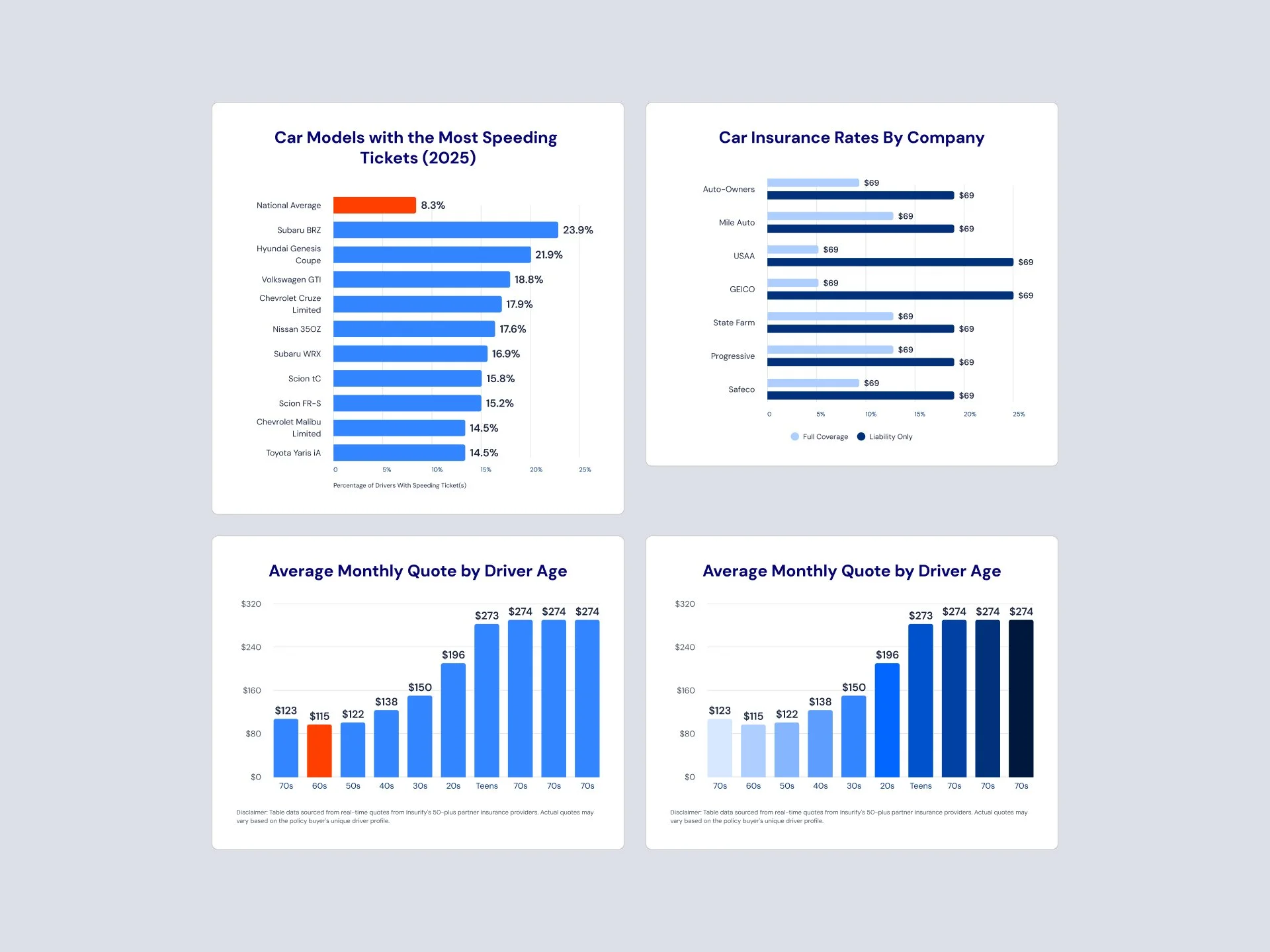
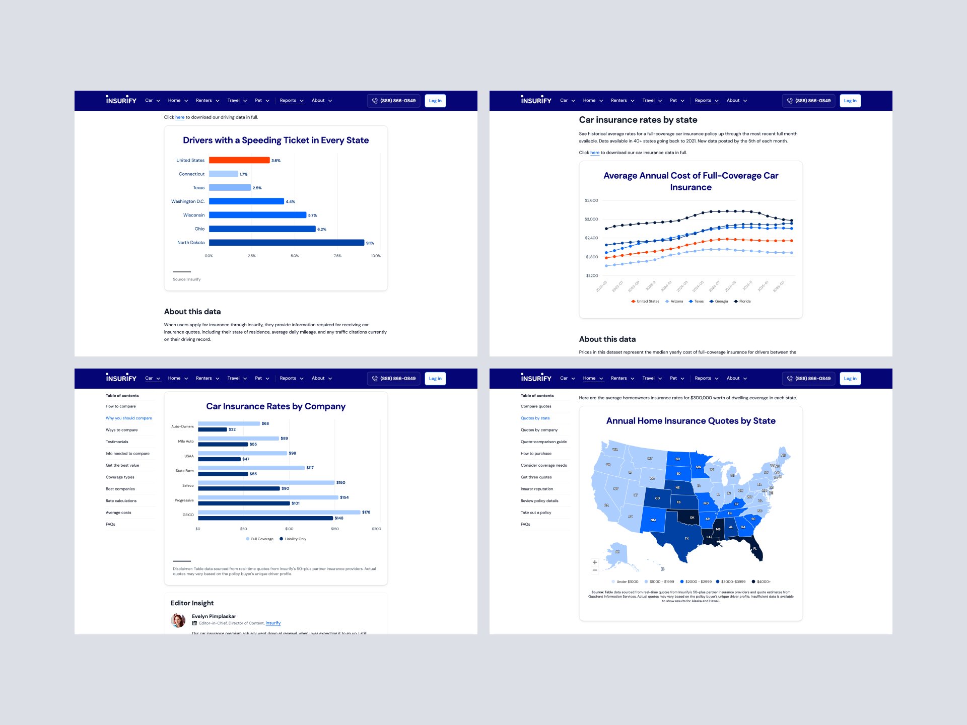
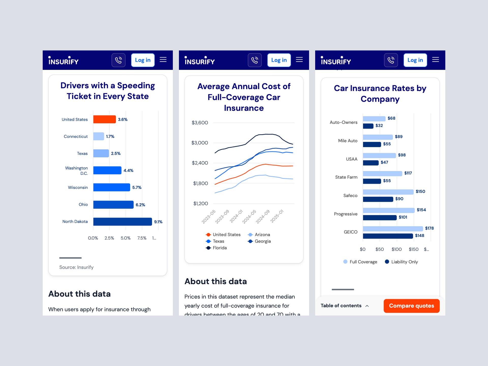
✅ Modular, Scalable Chart Components
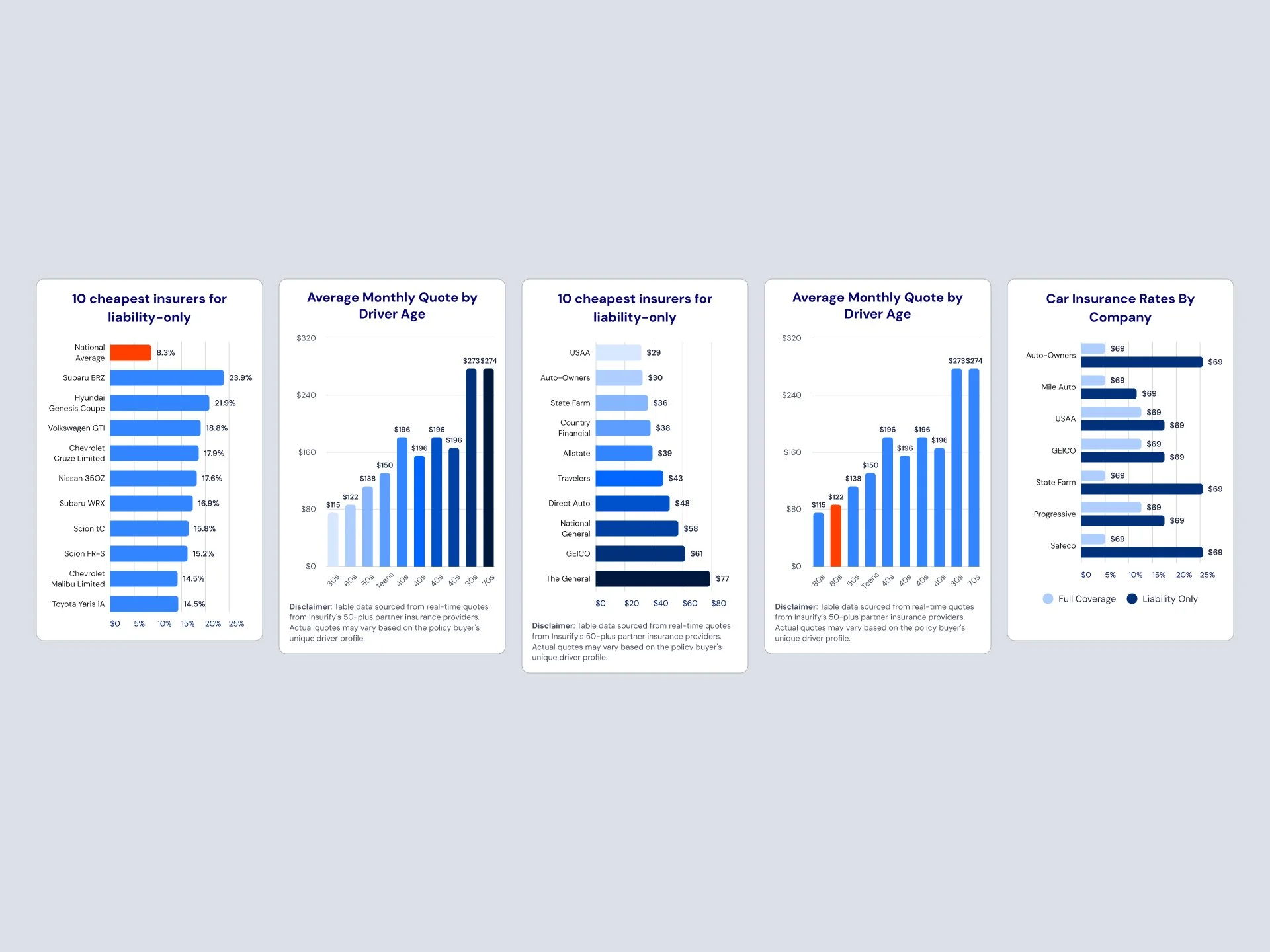
Built with Highcharts and styled to match our UI system
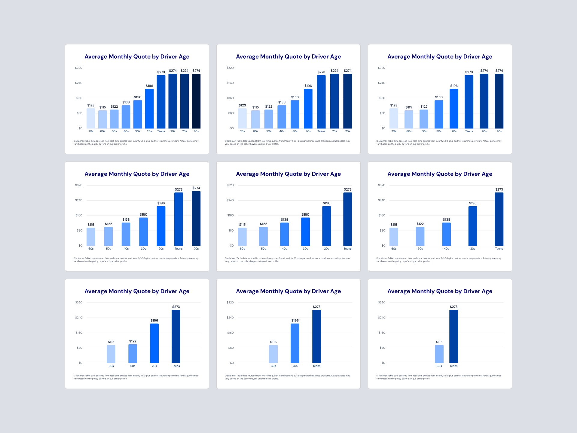
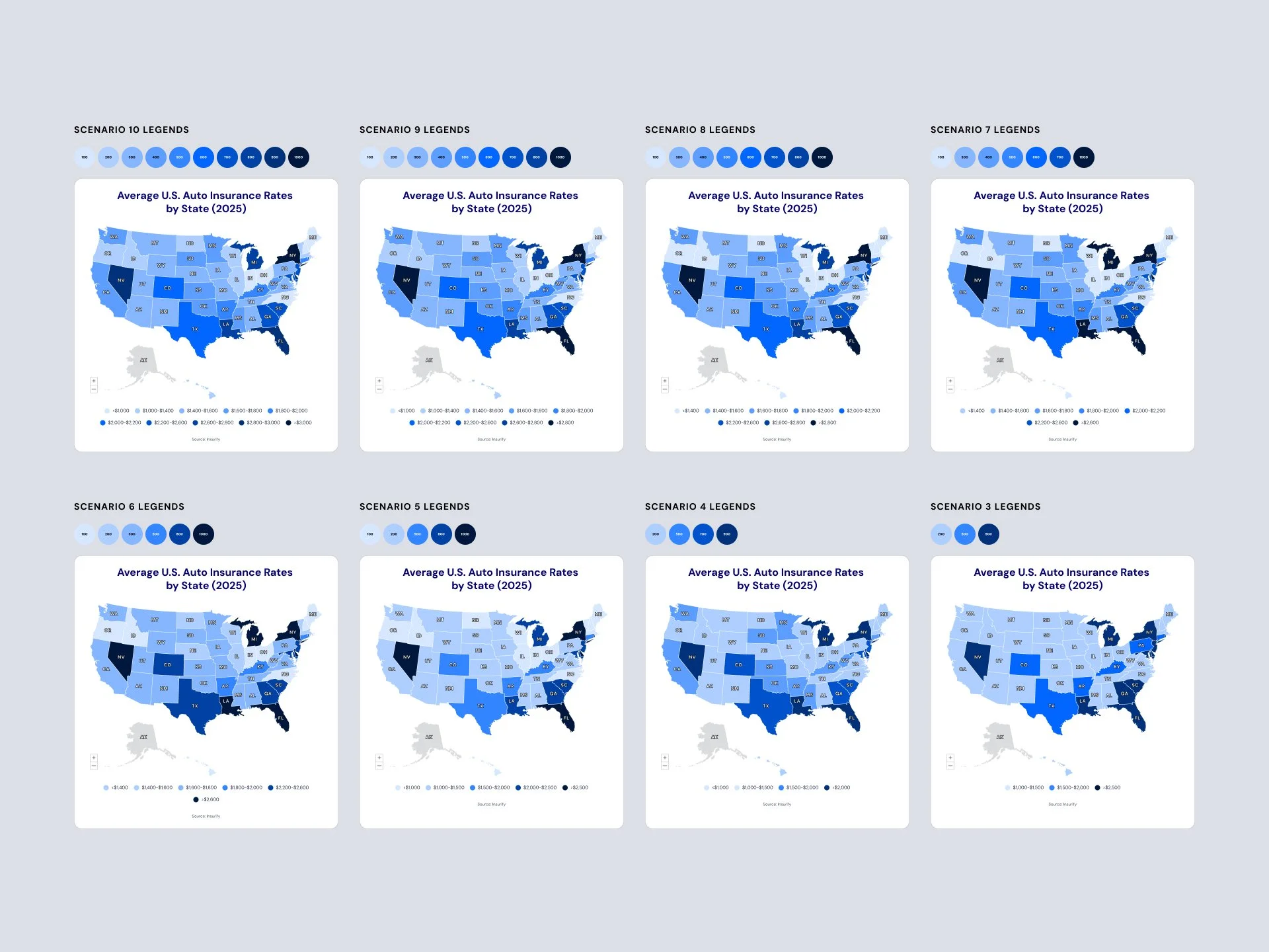
Responsive, edge-case-safe layouts for different data volumes
✅ Editorial Team Empowerment
Created a system where charts could be updated via CMS
No need for ongoing design or dev involvement post-launch
✅ Built for Performance and SEO
Clean markup, accessible interactions, and fast load times
Boosted engagement and organic search rankings
Outcomes
The redesigned homepage made trust visible and interaction simple—leading to higher engagement, stronger conversion, and improved user sentiment.
Link: Insurify Homepage
Timeline: 4 months (collaborative sprints)
Stakeholders: CPO, VP of Audience, Director of SEO, Product Manager, Lead Engineer