Brand & Creative · Milk Stork · 2024–presentOne brand,
every surface.
Full creative ownership for the #1 breast milk shipping company — rebrand, packaging, email, web, print, and campaigns. Built by one.
01
chapter OneRebrand — Identity System
A brand that finally matched the product's value.
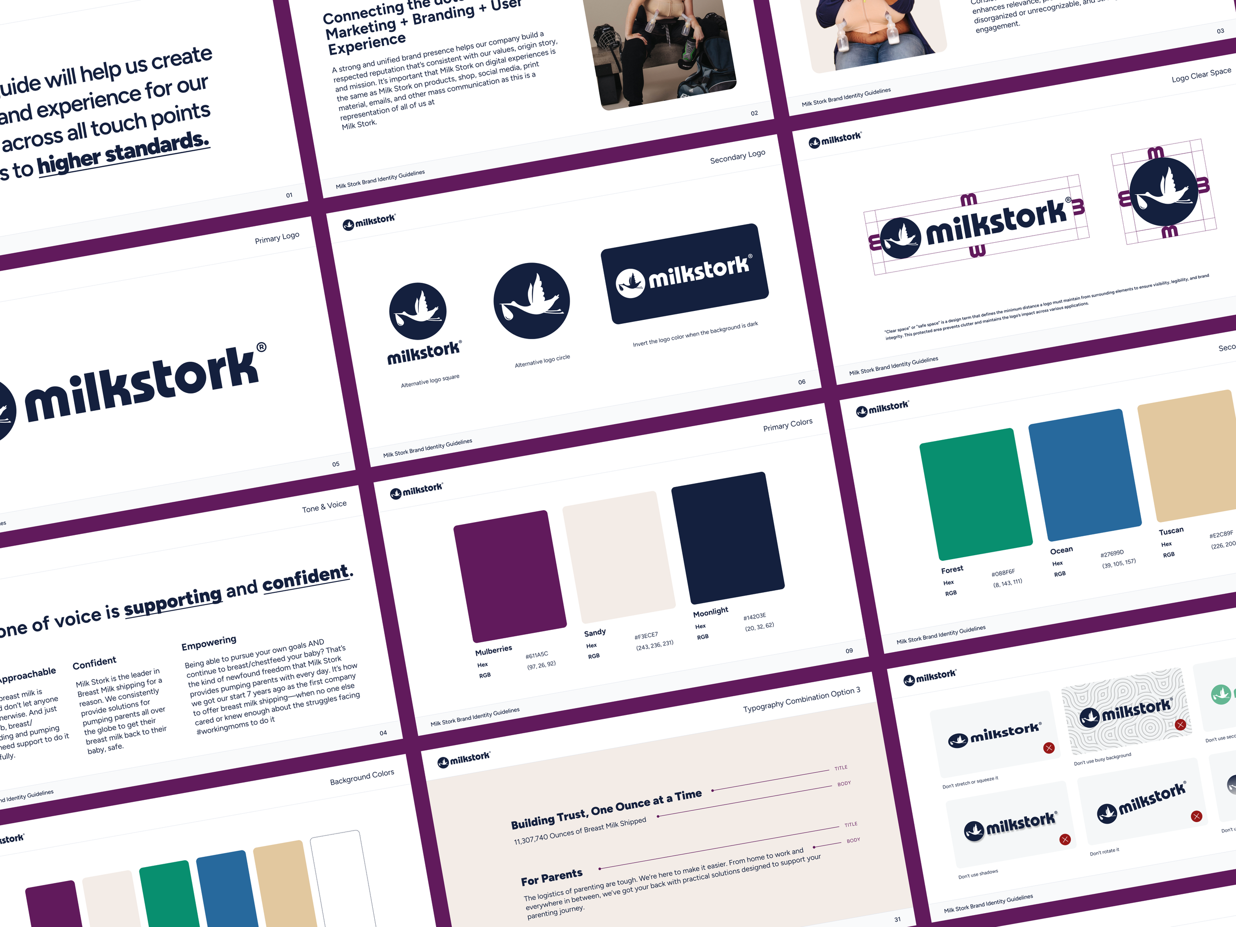
RebrandMilk Stork had a strong product, but a brand that read clinical and generic. The rebrand elevated the identity to match where the company was going: premium, trusted, and emotionally resonant. New wordmark, color system, typography, and full brand guidelines built to scale across every touchpoint.
• before• after Identity assetsFull brand guidelines including wordmark usage, color system, typography hierarchy, iconography, and tone of voice.
02
chapter twoPackaging — Boxes, Mailers & Inserts
The box is the first physical impression.
PackagingWhen a mother receives a Milk Stork kit, the packaging is the brand. I redesigned every surface: shipping box, mailer, inserts, and labels to feel premium and intentional, then took each piece through to final production files.
03
Chapter threeEmail Campaigns
Email as a brand moment, not a notification.
EmailI designed promotional and transactional emails that carry the same visual language as the rest of the brand. Every email feels like Milk Stork, not a system default.
Social & AdsConsistent at every scroll.
Social posts, paid ads, and campaign graphics that carry the brand into the feed. The visual system was designed to work at small sizes and fast scroll speeds, recognizable at a glance, on-brand at every format.
05
Chapter fiveWebsite & Landing Pages
The brand in its most visible form.
WebHubSpot marketing site design, conversion-focused landing pages, and surrogacy-specific page design. Every page was designed with the dual audience in mind, working mothers and the HR teams buying on their behalf.
06
Chapter sixPrint Collateral
Brochures, one-pagers, sell sheets, event materials, and any printed piece that carries the Milk Stork brand into the physical world. All files prepared to production spec and sent to print.
Physical brand presence at every touchpoint.
Print
07
Chapter sevenDecks & Presentations
The brand in the boardroom.
DecksSales decks, investor presentations, and internal brand communications. Every slide was built to look as considered as the rest of the visual system — because how a company presents itself internally is part of the brand too.
OutcomeImpact
Full
Creative ownershipEvery visual surface, digital, print, packaging, email, web, decks, designed and produced by one designer.
7+
Creative areas coveredEvery visual surface, digital, print, packaging, email, web, decks, designed and produced by one designer.
Zero
Agency dependencyFull in-house creative capability built from the ground up. Strategy, design, and production all owned internally.
04
Social Media & Advertising