Brand & Data Visualization · Insurify · 2022–2024Making data
human.
Charts, infographics, brand guidelines, design systems, and swag — applied brand thinking at every scale, from a single axis label to a company hoodie.
01
chapter OneData Visualization & Editorial
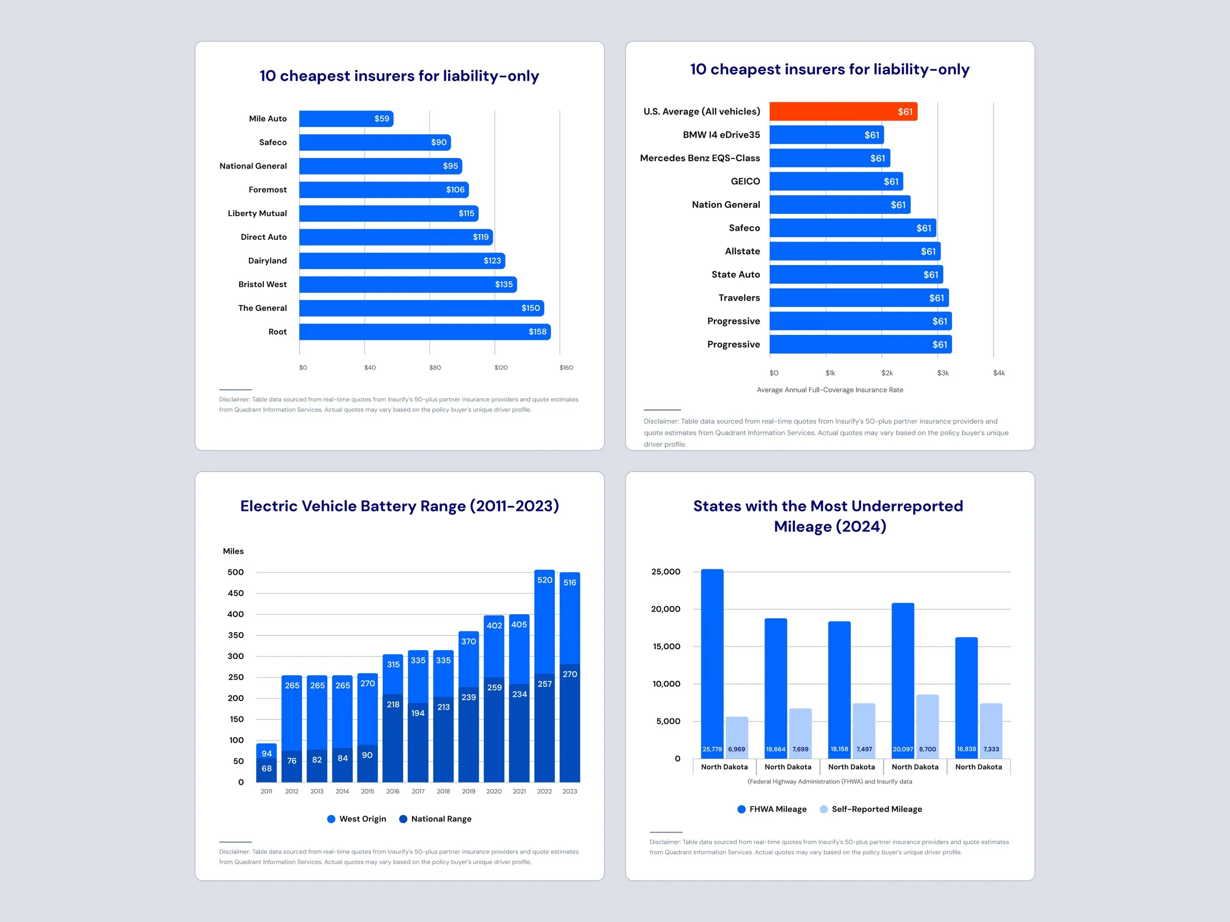
Insurify's editorial team publishes data-driven insurance reports, state-by-state guides, and trend stories. I designed the charts, infographics, and data graphics that made complex insurance data legible and on-brand — bar charts, line graphs, comparison tables, social data cards, and full editorial infographics.
Turning insurance data into stories people actually read.
Data vizEditorial chartsCharts and infographics designed for Insurify's editorial team — published across reports, guides, and social content.
02
chapter twoBrand Guidelines
Rules that give the team freedom.
BrandInsurifyCompareContributing to Insurify's brand guidelines, documenting color usage, typography, logo rules, and visual standards so the whole team could produce on-brand work consistently. When Compare.com was acquired, I also helped align both brands under a shared visual framework.
Two brands. One system. Zero confusion.
design systemsShared foundation
Spacing, grid, type scale, and base component structure drawn from one shared token set.
Brand theming
Color and typography tokens overridden per brand — same component, different visual identity.
Outcome
Teams could build for either brand without duplicating work or breaking consistency.
Multi-brand systemWhen Insurify acquired Compare.com, the design challenge wasn't just visual, it was structural. Two distinct brand identities, two separate audiences, one shared component library. I worked on aligning both brands under a unified design system: shared tokens, theming logic, and component rules that let each brand stay distinct while drawing from the same foundation.
04
Chapter fourIcon System — Illustrated Visual Language
Complex concepts. One glance.
Icon systemStyle
Multicolor illustrated — teal, orange, yellow, blue
Coverage
Every insurance category — auto, home, health, life
Usage
Editorial articles, UI components, marketing pages
Custom illustrated icon system covering every insurance coverage type — built for editorial content, UI components, and marketing pages at any size.
Insurance is dense, liability, collision, comprehensive, gap, UM/UIM, MedPay. Readers' eyes glaze over before the second paragraph. A custom illustrated icon system gave each coverage type a distinct, memorable visual identity while staying consistent in style, weight, and color across the full set. Built to work at small UI sizes and large editorial placements equally.
OutcomeImpact
100+
Data graphics producedCharts, infographics, and social data cards designed for Insurify's editorial publishing pipeline.
2
Insurify and Compare.com visual standards consolidated after acquisition into one coherent framework.
Brands alignedFull
Brand rangeFrom a single chart axis label to a company hoodie, brand applied consistently at every scale.