
MilkStork.com · SAAS HR Benefits Management · 2024 - presentTurning raw data into decisions HR can act on.
HR teams were investing in a benefit they couldn't measure. I designed a reporting platform that turned fragmented data into clear, actionable program insights.
1,000+
Benefit shipments tracked and reported monthly
35%
Reduction in manual reporting requests from HR teams
20%
Increase in benefit program utilization through improved visibility
01. The Problem
HR teams were spending on a benefit they couldn't prove was working.
Companies offering Milk Stork as a benefit had no visibility into how employees were actually using it. When it came time to justify the program to leadership, HR managers had nothing to show.
The questions were always the same, and nobody could answer them. Data existed in the system, but it was fragmented, hard to export, and even harder to interpret.
It wasn't a data problem. It was a visibility problem.
HR Manager — most common question to support
HR Manager — most common question to support
HR Leader — quarterly review feedback
❌ Data was fragmented. Shipment records, employee participation, and utilization figures lived in separate places with no unified view.
❌ Exports were unusable. The only way to get data was a raw CSV dump, no context, no visualizations, no narrative for leadership.
❌ Support was absorbing the gap. HR managers were emailing the Milk Stork team every quarter just to get basic program numbers.
02. The Opportunity
The data already existed. It just needed a face.
Milk Stork's operational data was rich, including shipments, employee participation patterns, utilization by benefit type, and seasonal trends. The opportunity wasn't to collect more data. It was to surface what already existed in a way that HR leaders could actually use.
What was broken
HR teams had no self-serve access to program data. Every question required a support request. Every quarter meant another manual export. Decision-making was blocked by access.
Design opportunity
Build a reporting experience that makes program performance immediately understandable, so HR teams can monitor, compare, and present results without any help from Milk Stork's team.
The goal: make the data self-explanatory. An HR manager should be able to open the dashboard, understand their program performance in under 60 seconds, and share that story with leadership.
03.Design
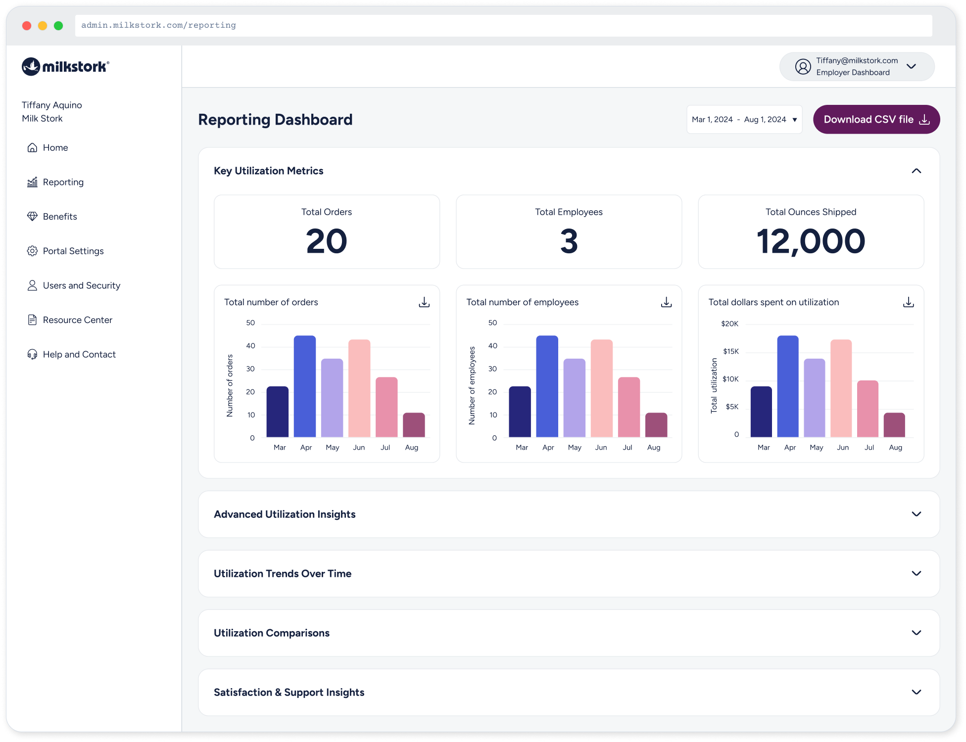
I structured the dashboard around the four questions HR leaders actually need to answer not around what data was technically available. The hierarchy moves from "what's happening now" to "why it's happening" to "what to do about it."
One dashboard. Four questions answered.
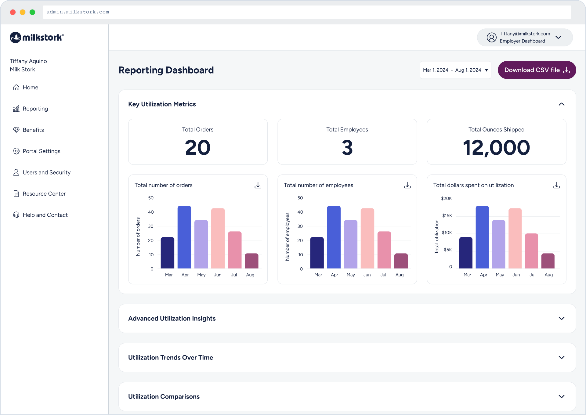
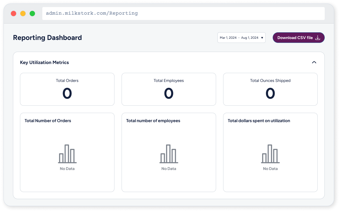
✅ Key Utilization Metrics. Top-level stat cards answer the most basic question: how many employees, orders, and ounces? Available at a glance, no scrolling required.
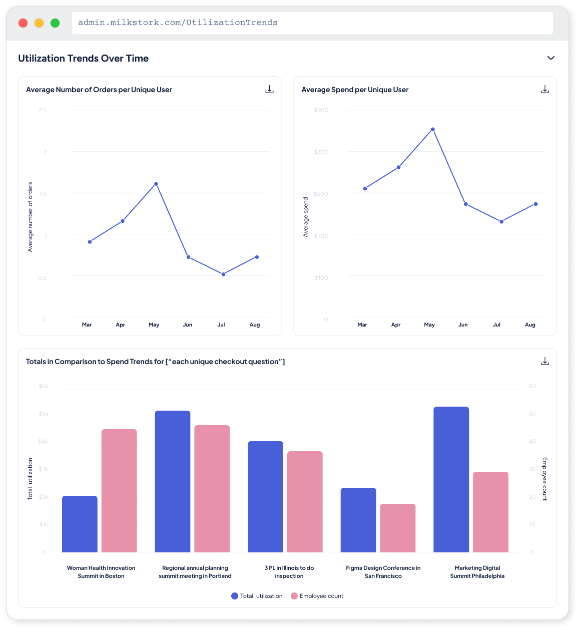
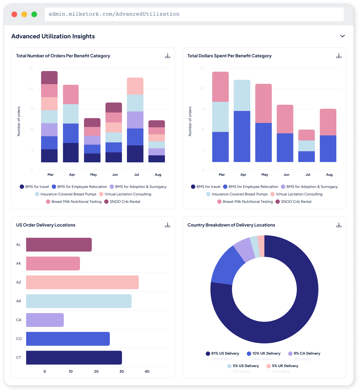
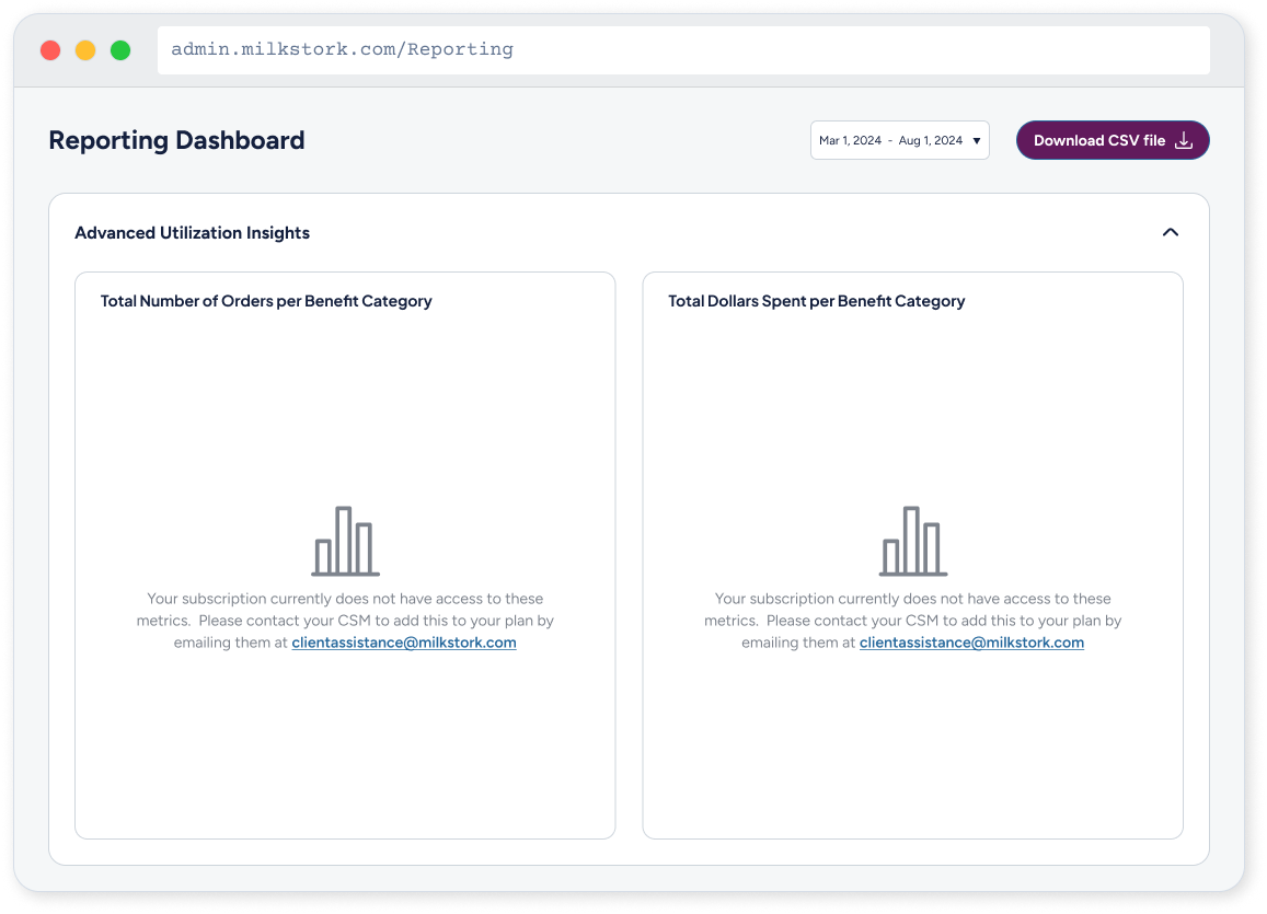
✅ Advanced Utilization Insights Charts break down orders and spend over time giving HR managers the trend data they need to forecast and plan.
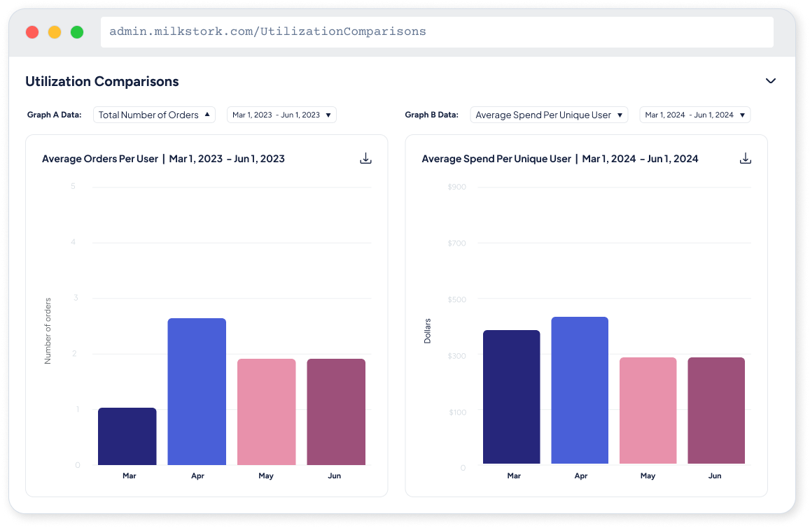
✅ Utilization Comparisons. Year-over-year and benefit-type comparisons let HR teams measure growth and identify which programs deliver the most value.
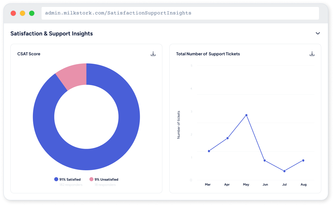
✅ Satisfaction & Support Insights Closes the loop, linking usage data to employee satisfaction signals so HR can make the case for program expansion.
04. Key Design Decisions
Every choice was about reducing cognitive load
HR managers open this dashboard at most once a quarter. They're not power users. Every design decision had to support someone who needed answers fast, with no training and no tolerance for confusion.
Collapsible sections
Progressive disclosure lets HR managers start with the summary, then drill into detail only when they need it. The default view answers 80% of questions.
CSV export always visible
The download button stays pinned in the header. HR managers need to share data with leadership by removing that friction was non-negotiable.
Date range picker
Quarter-over-quarter and year-over-year are the two most common comparisons. The date picker defaults to the last 6 months but supports any custom range.
Notification system
Pickup timing changes needed to reach HR managers immediately, not buried in email. The alert banner surfaces operational updates directly in context.
05. Results
What this taught me: The best data visualization isn't the most impressive one, it's the one that makes the right decision obvious. Every chart, every label, every drill-down path should be justified by the question it helps someone answer faster.
The reporting dashboard shipped to 30+ employer organizations and immediately reduced the manual reporting requests that had been absorbing Milk Stork's support team. HR managers could now open the dashboard, pull a quarter of data, and present it to leadership without any help.