Reducing Friction in the Languex Sign-Up Experience
Overview
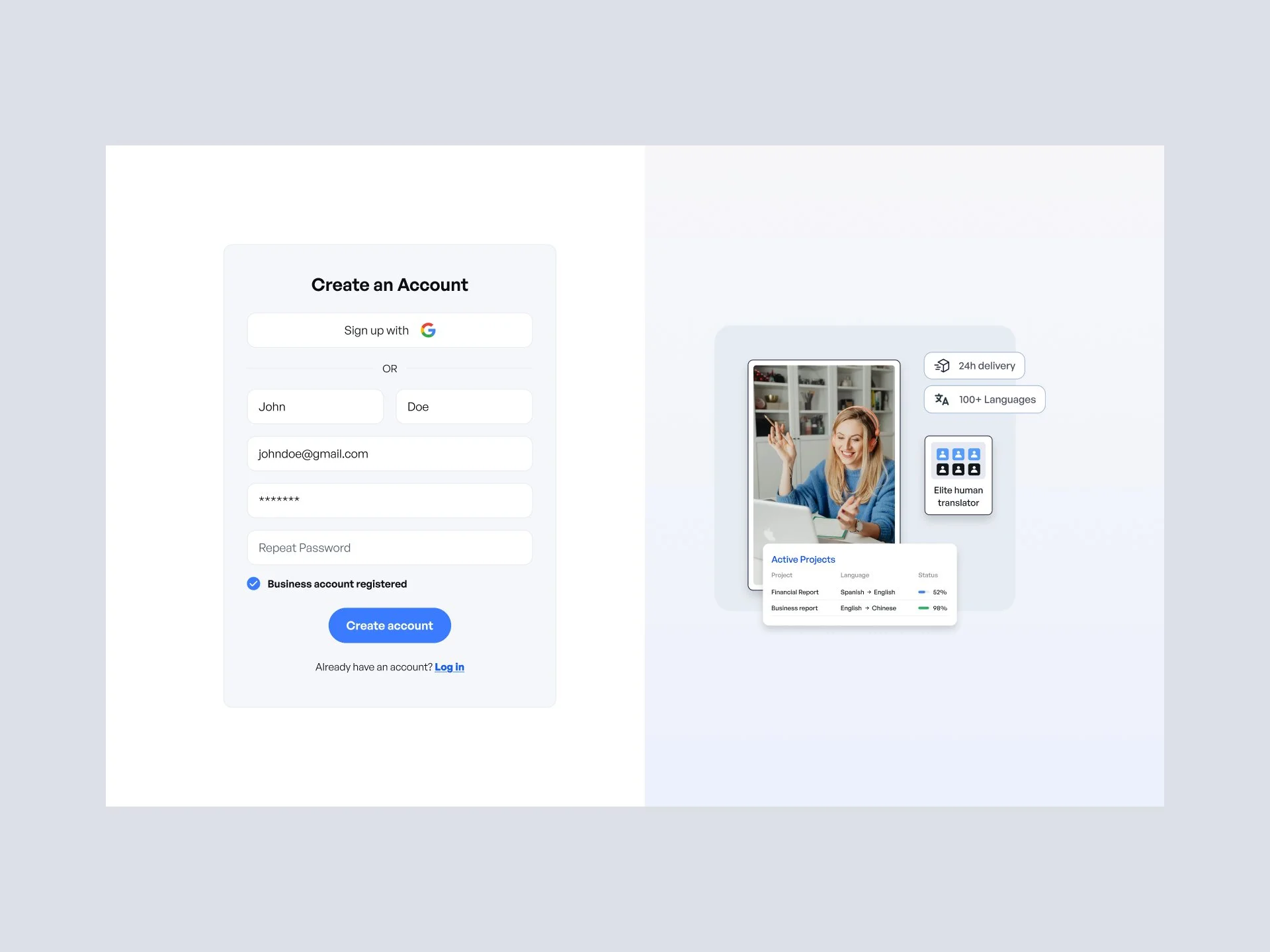
Languex is a language services platform supporting both individual users and business customers. This project focused on simplifying the sign-up experience so new users could create an account quickly and clearly understand the next steps.
The Problem
The existing sign-up flow had a few challenges:
Users often abandoned the process because the flow did not clearly guide them through the required steps.
Too many steps felt similar, making the process feel longer than necessary
Individual and business users weren’t clearly separated early on
Error states didn’t clearly explain what went wrong or how to fix it
Verification and confirmation steps felt abrupt and disconnected
As a result, users could feel unsure about where they were in the process or what to do next.
The Goal
Create a sign-up flow that:
Feels simple and calm
Clearly separates individual vs business paths
Reduces errors and confusion
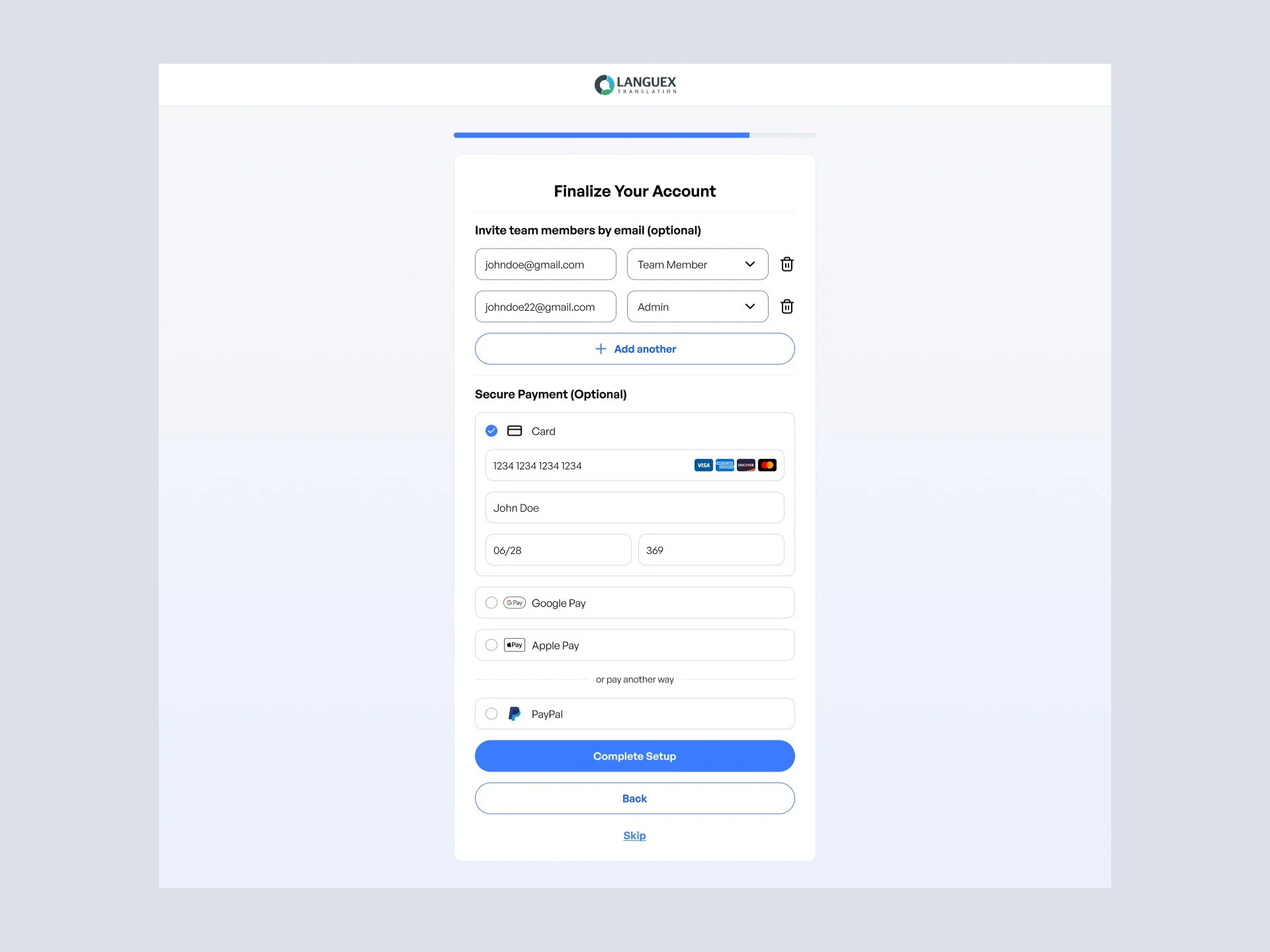
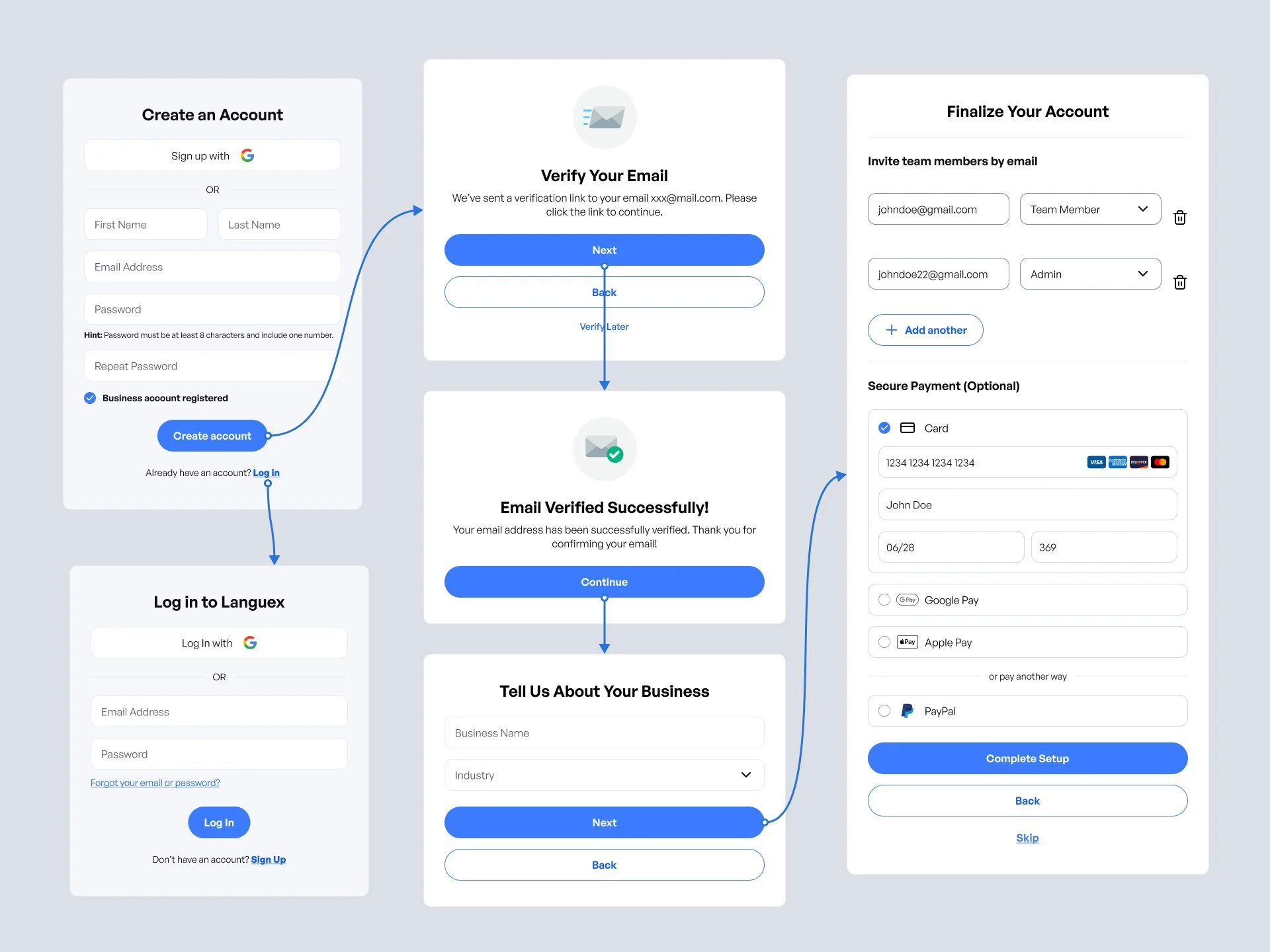
Guides users step-by-step until their account is ready
My Role
I led the UX and UI design for the sign-up experience, including:
Flow structure and screen sequence
Layout and form clarity
Error, verification, and success states
Visual consistency across all steps
Key Onboarding Improvements
1. Clear entry paths
Users choose early whether they are signing up as an individual or a business, which immediately reduces cognitive load.
2. Focused, single-purpose screens
Each step focuses on a single task so users always know what to do next.
3. Friendly error handling
Error states explain:
What went wrong
What needs to be fixed
How to continue
No guesswork or technical language.
4. Reassuring verification & success states
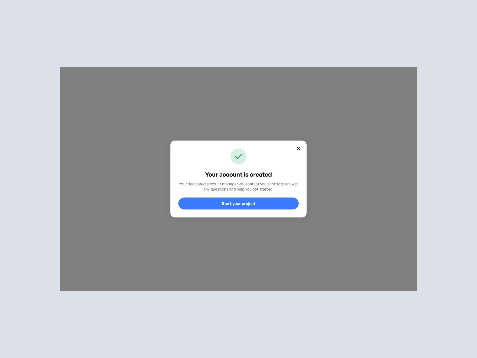
Email verification, confirmation, and success screens clearly communicate progress and next steps, helping users feel confident they’re “done.”
Outcome
A more streamlined, predictable sign-up flow
Clear separation between user types
Fewer points of confusion during onboarding
A polished, professional first impression