Milk Stork Account Landing Experience
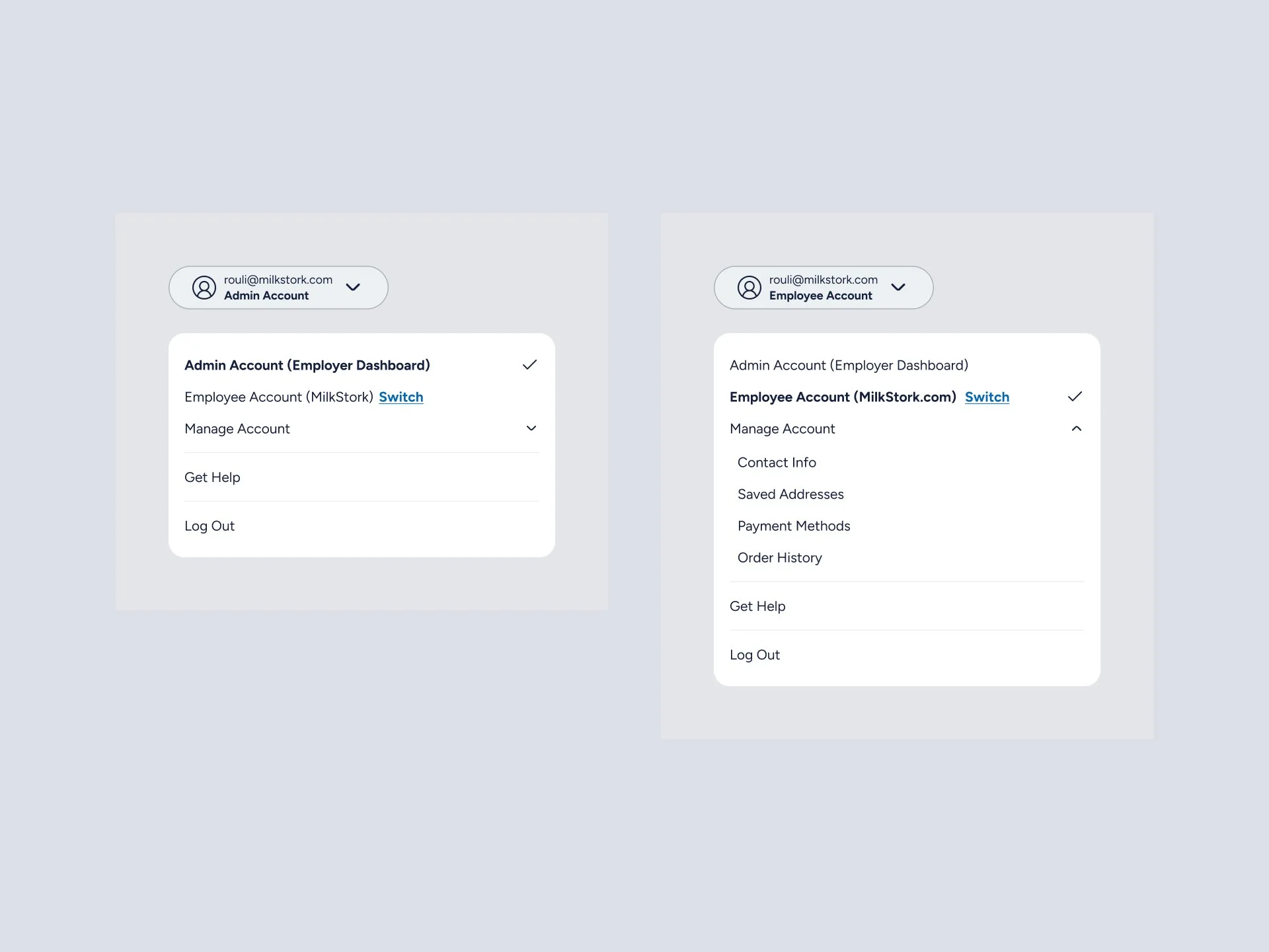
The Problem
After logging in, users often felt unsure about where to go next. Depending on how they entered the product, they landed on different pages, which made it easy to miss important actions. This led to hesitation, extra navigation, and confusion—especially for first-time or infrequent users.
My Insight
The issue wasn’t that users needed more features or more navigation options. They needed orientation. A clear starting point that answered one simple question:
“What should I do next?”
Helping users feel grounded immediately after login would reduce confusion and make the rest of the experience feel easier and more intentional.
My Role
I led the design work for this experience, including:
Defining the post-login experience and layout
Deciding what actions should be prioritized
Designing the visual structure and reusable components
Working closely with product and engineering to ensure the solution could scale
Design Process
I started by reviewing where users landed after login and identifying common points of confusion. From there, I focused on simplifying the experience rather than adding more choices.
I explored several layout options to test how actions could be grouped and ordered. The goal was to make the page easy to scan, with clear emphasis on the most important next steps. I intentionally kept language simple and avoided overloading the page with information.
As the design evolved, I refined hierarchy, spacing, and content grouping to make the experience feel calm, clear, and flexible enough to support future features.
Solution
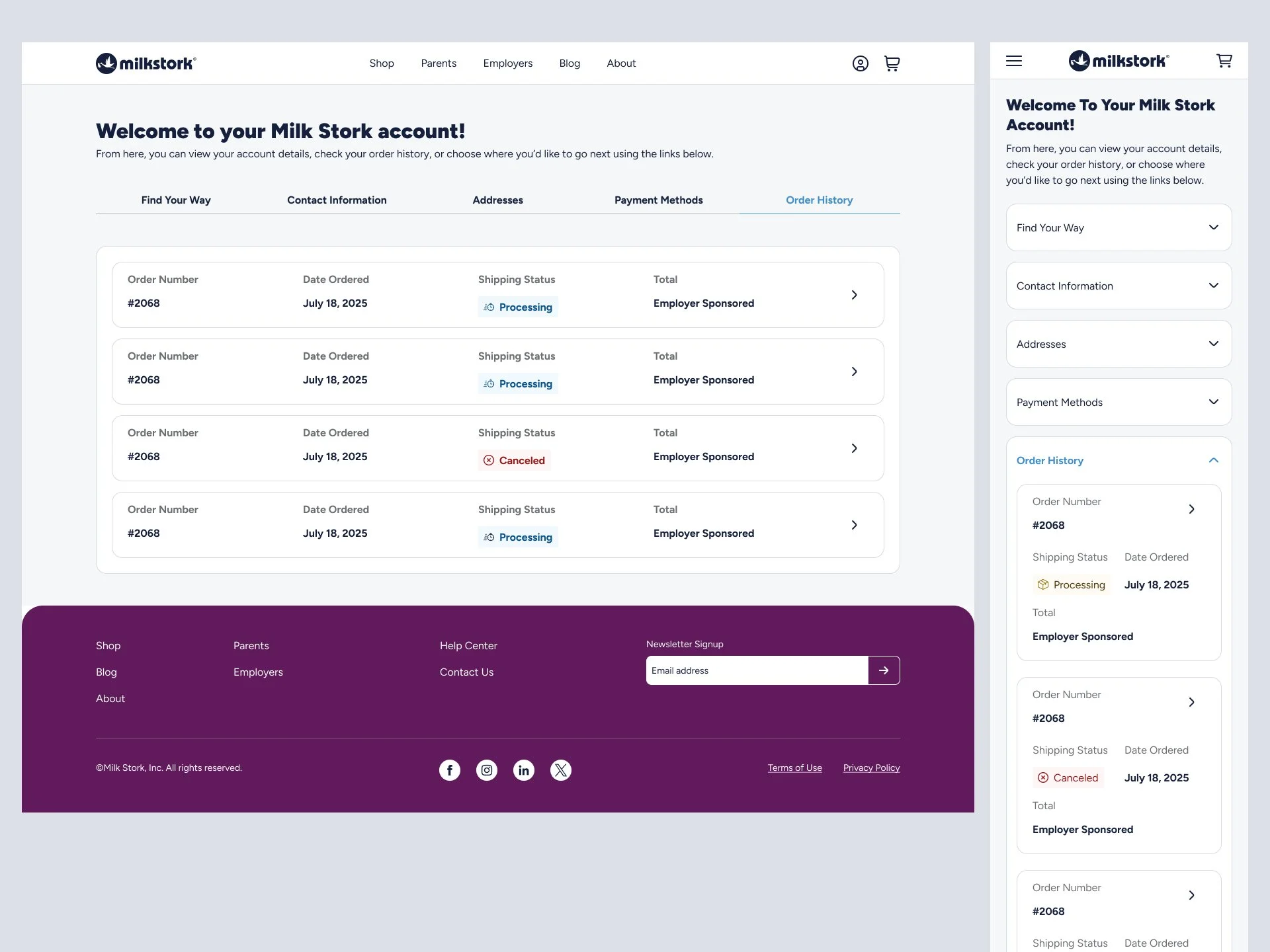
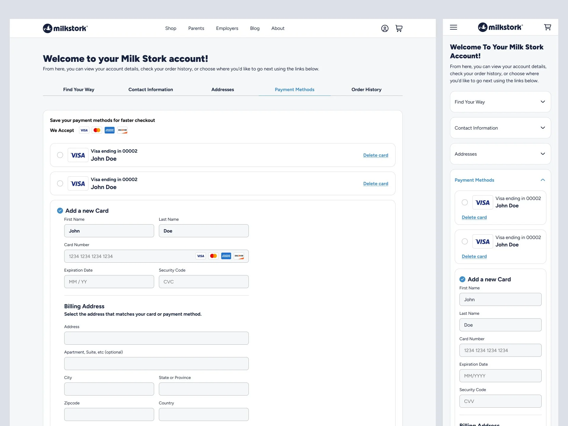
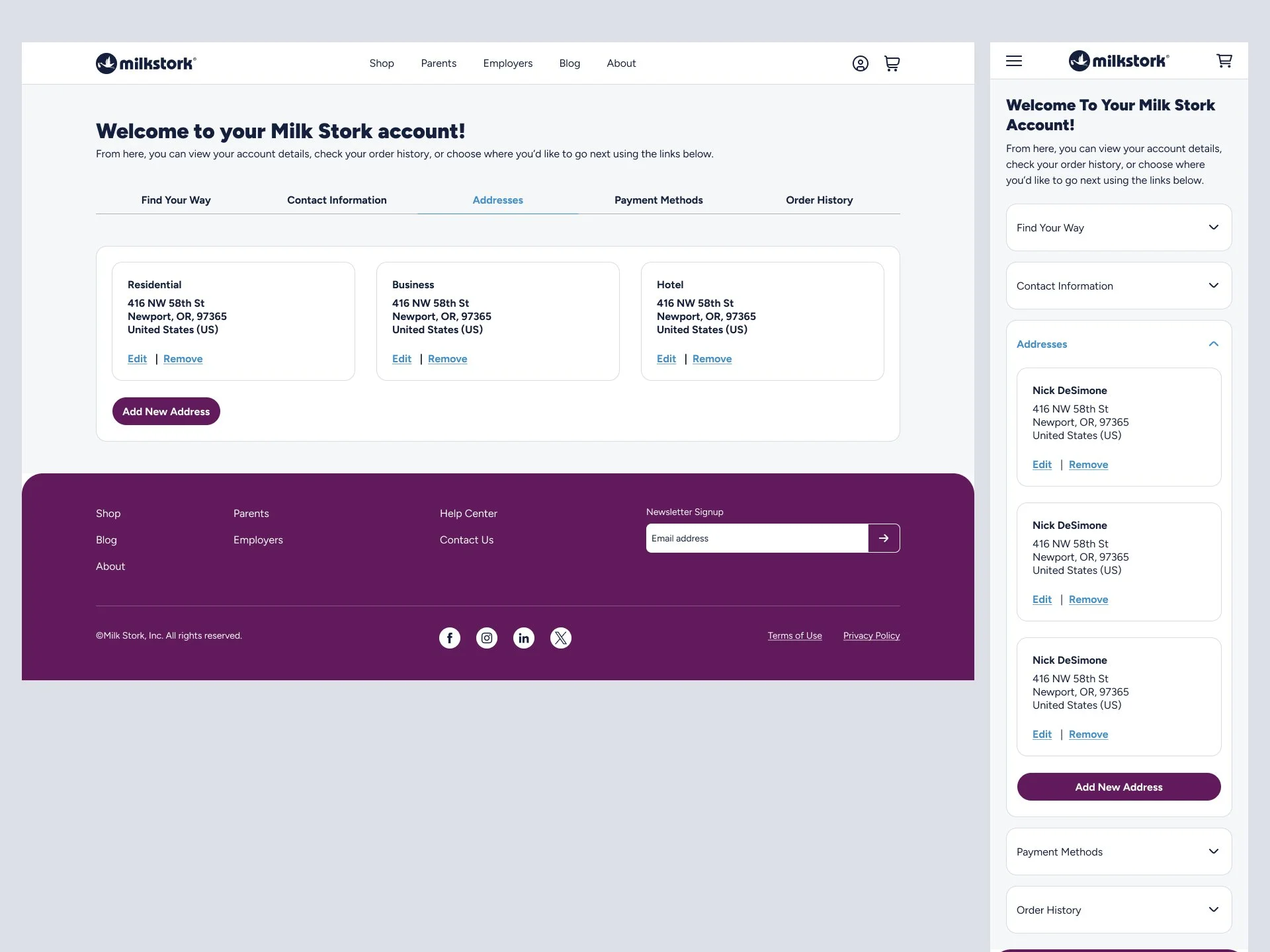
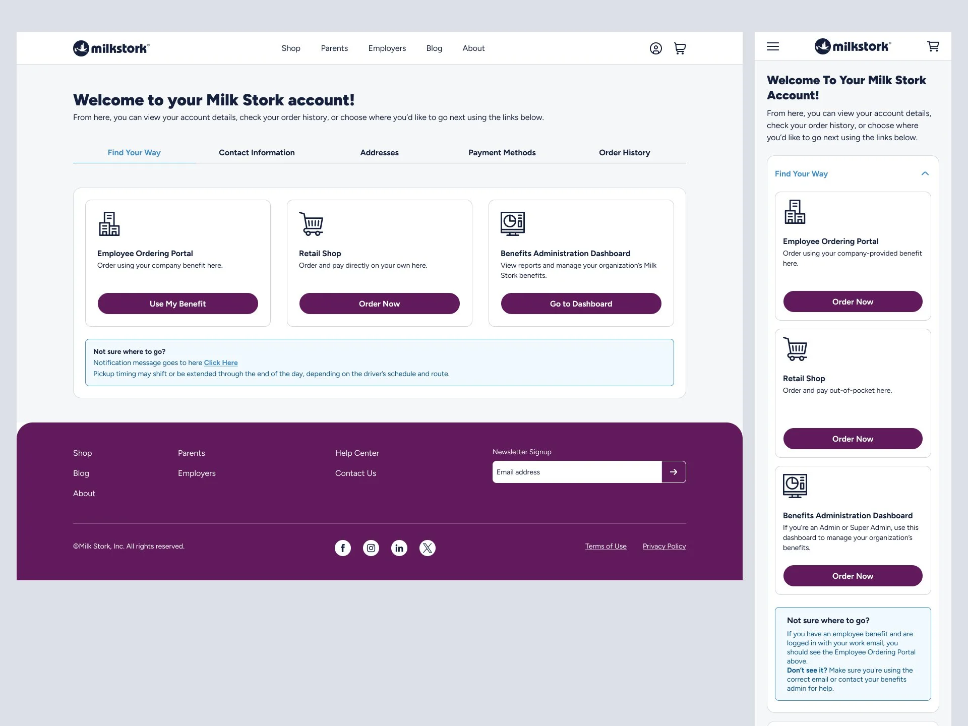
I designed a dedicated post-login landing page that:
Gives users a clear place to start
Highlights the most relevant next actions
Groups tasks in a simple, easy-to-scan layout
Uses modular sections that can grow over time
The result is a more confident, guided experience that helps users move forward without feeling lost.
Outcome
32% reduction in post-login drop-off
41% increase in users completing a primary action
27% decrease in navigation-related support requests
22% faster time to first action after login
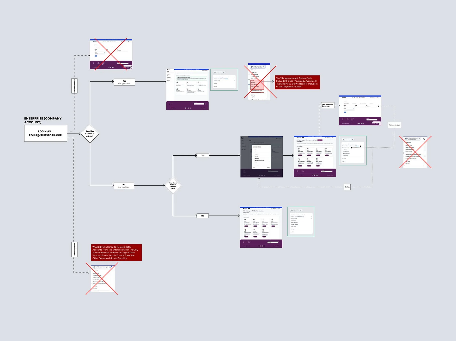
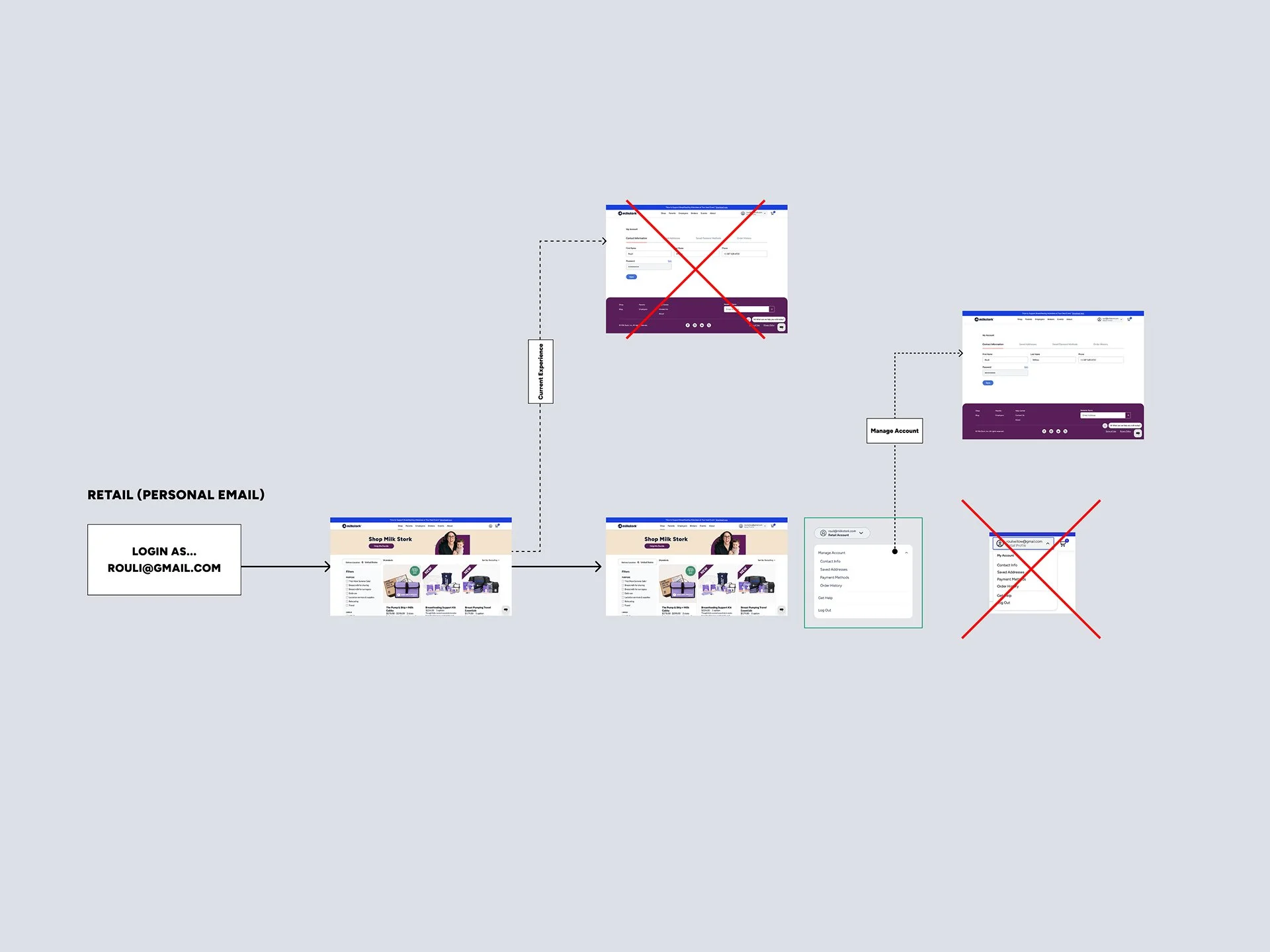
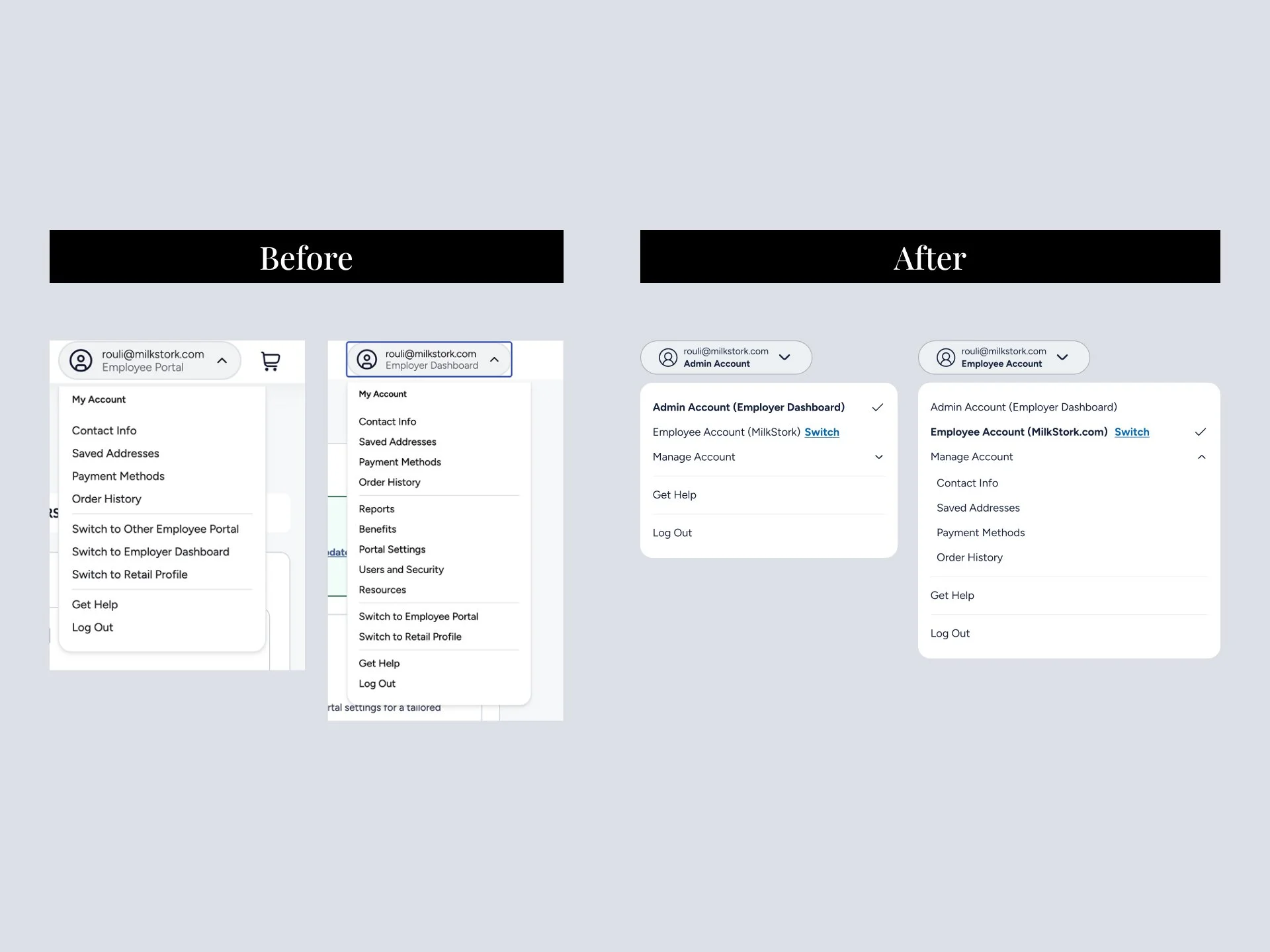
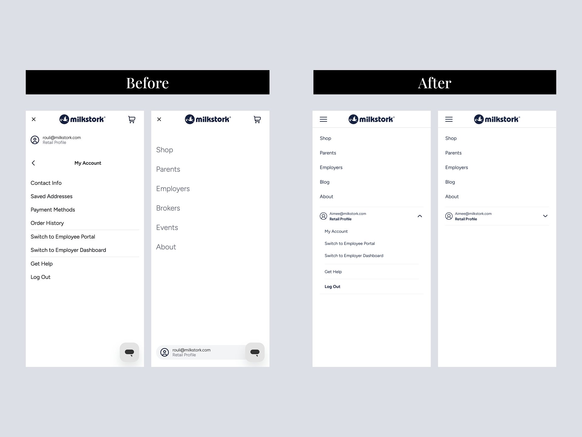
This post-login landing experience was the foundation for improving the entire account experience. By removing confusion at the moment users logged in, we reduced friction across all account flows and created a clear, consistent starting point. This made it easier for users to move forward confidently and allowed the team to improve and scale the rest of the account without introducing new complexity.