Scaling Smart: A Multi-Brand Design System for Insurify & Compare.com
Quick Wins
MVP launched in just 4 months
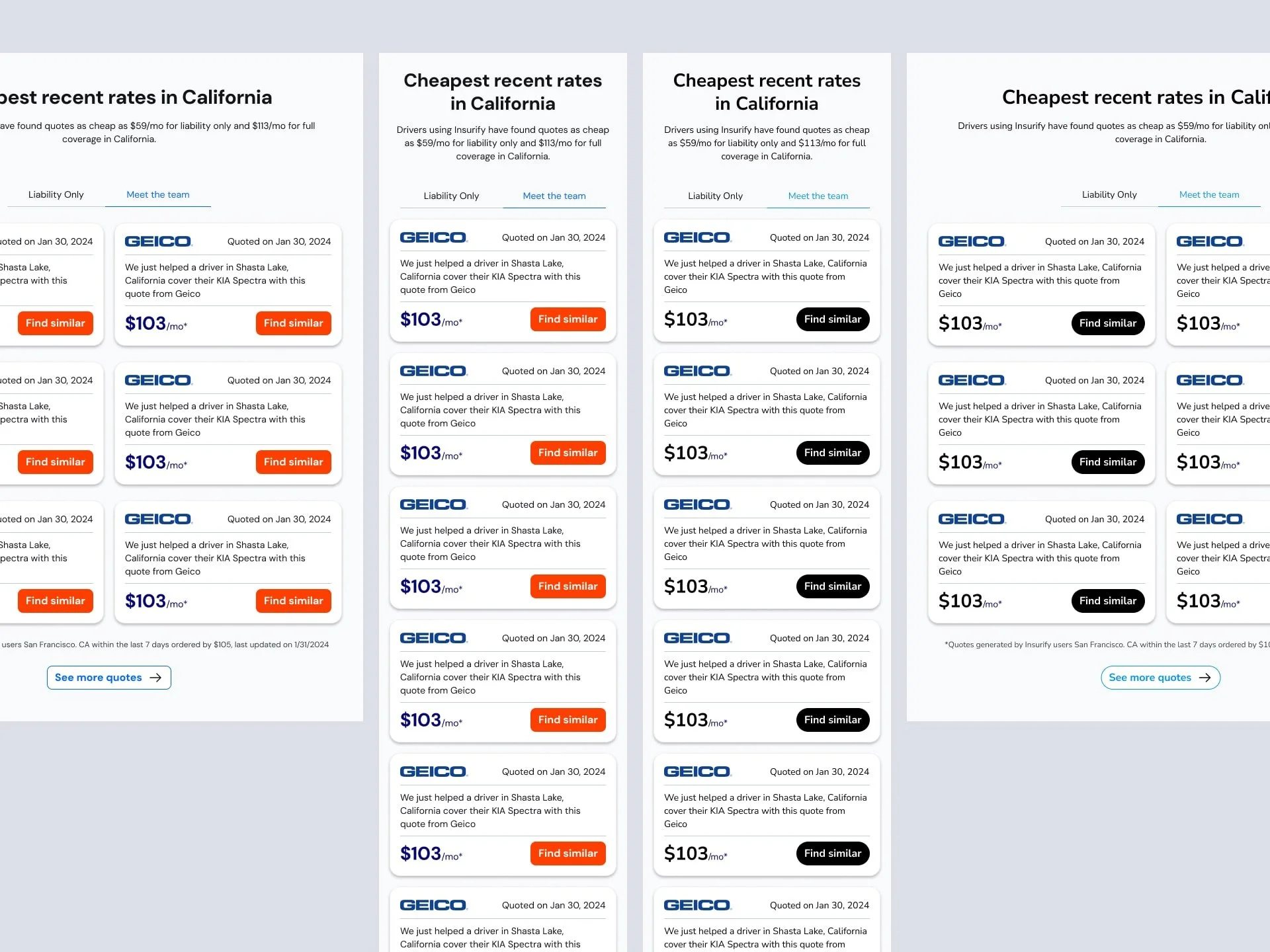
70% shared components across brands
40% reduction in maintenance overhead
Role
Design Manager
I led UX strategy and system architecture for a new multi-brand design system serving both Insurify and Compare.com. Working hands-on with a small but mighty team, I focused on scalable components, token-based theming, and empowering self-service for designers and developers alike.
Background & Goal
With two brands and limited resources, we needed a design system that could scale fast, without sacrificing identity or consistency.
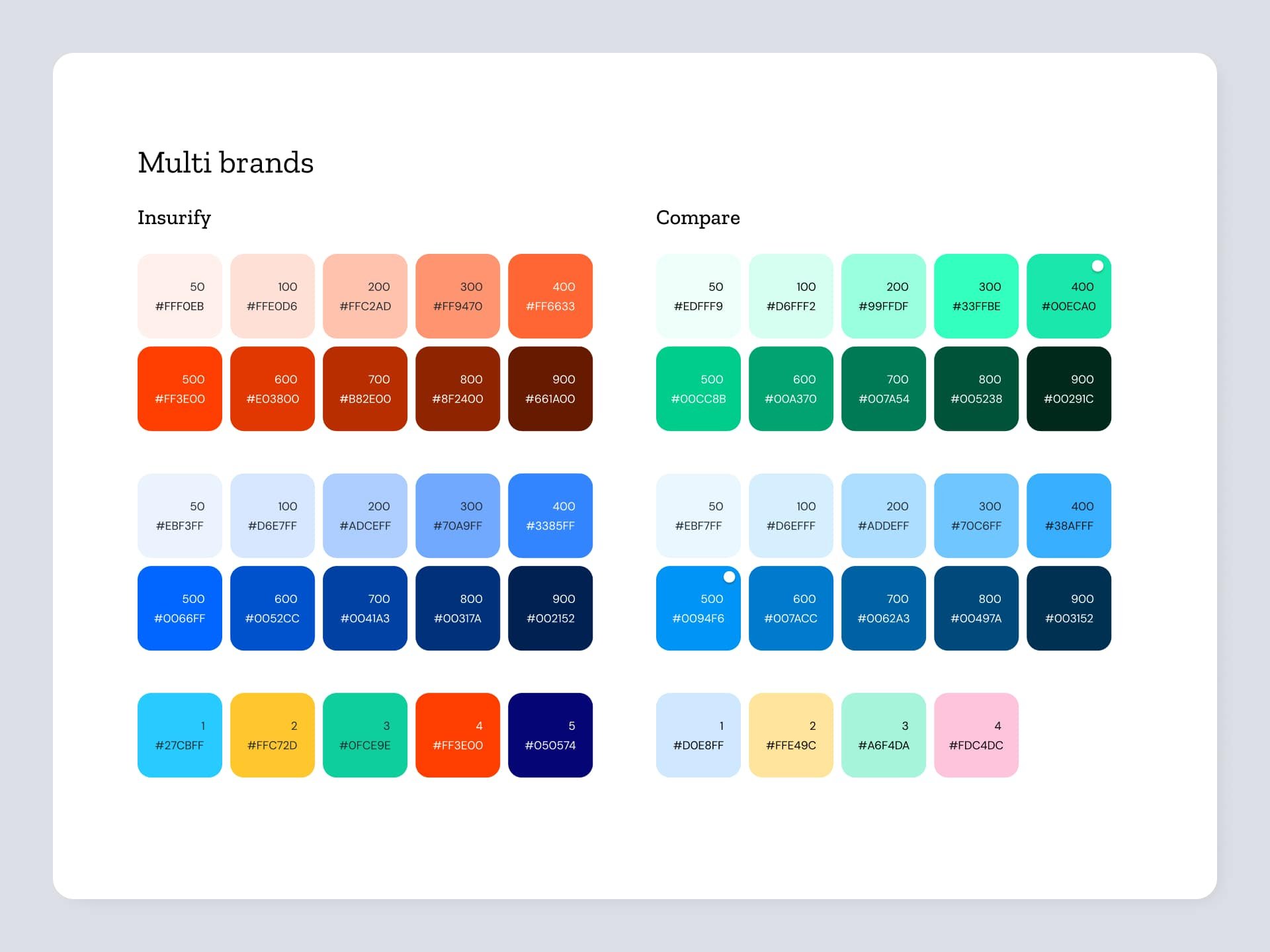
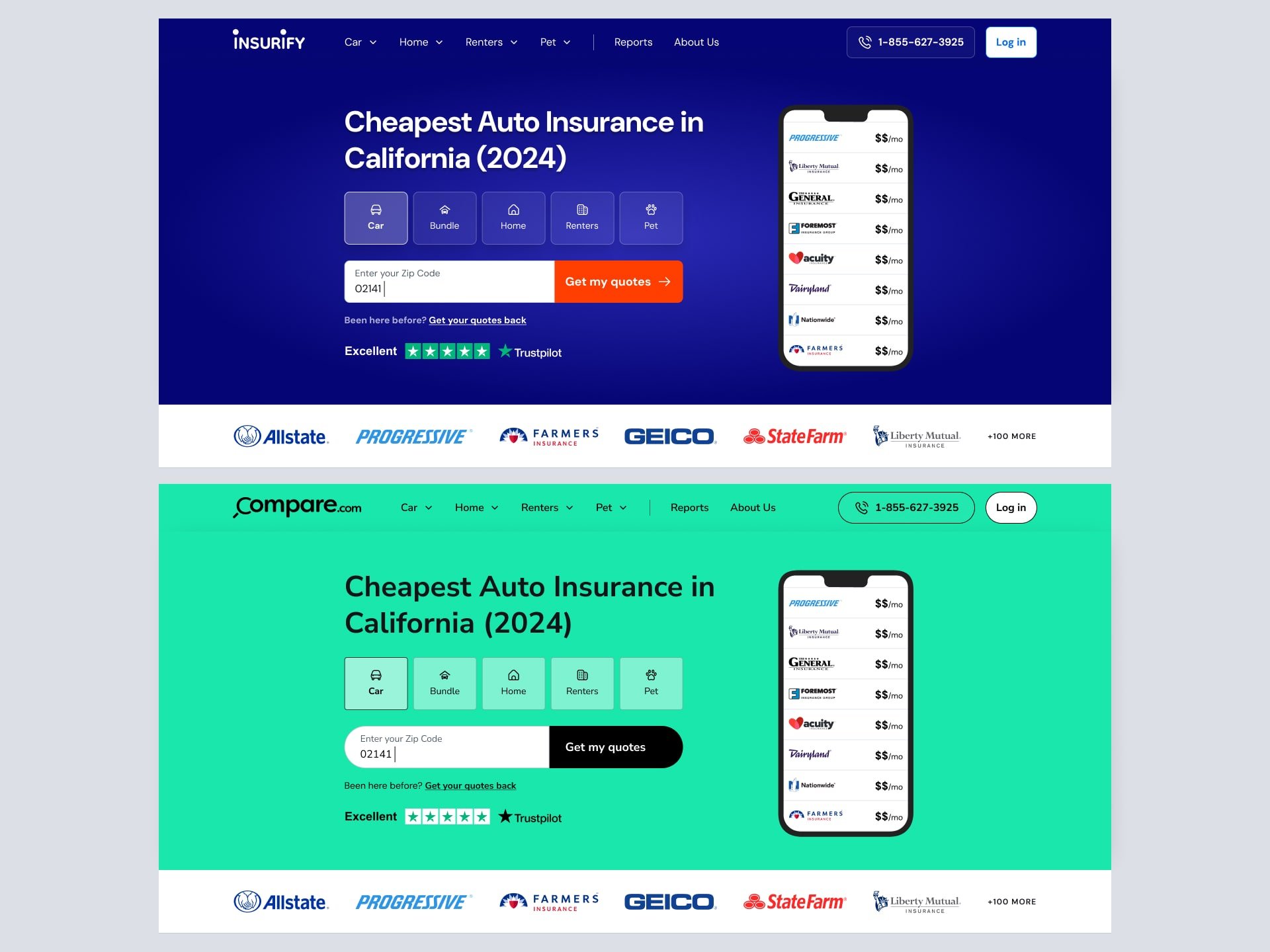
Unify UI foundations while keeping brand voices distinct
Speed up product development across teams
Reduce duplication and maintenance costs
Lay groundwork for future brand rollouts
Solutions
Build Only What Matters First
We focused on core components and high-impact use cases to get the MVP out fast, without overwhelming the team or overengineering.Use Tokens to Enable Multi-Brand Theming
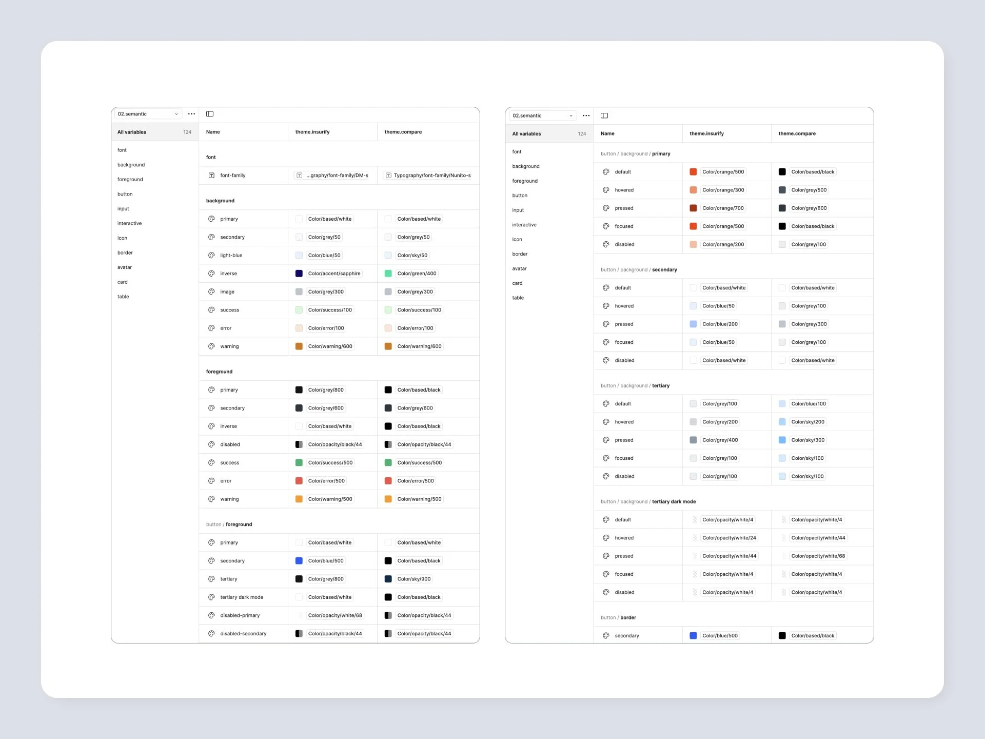
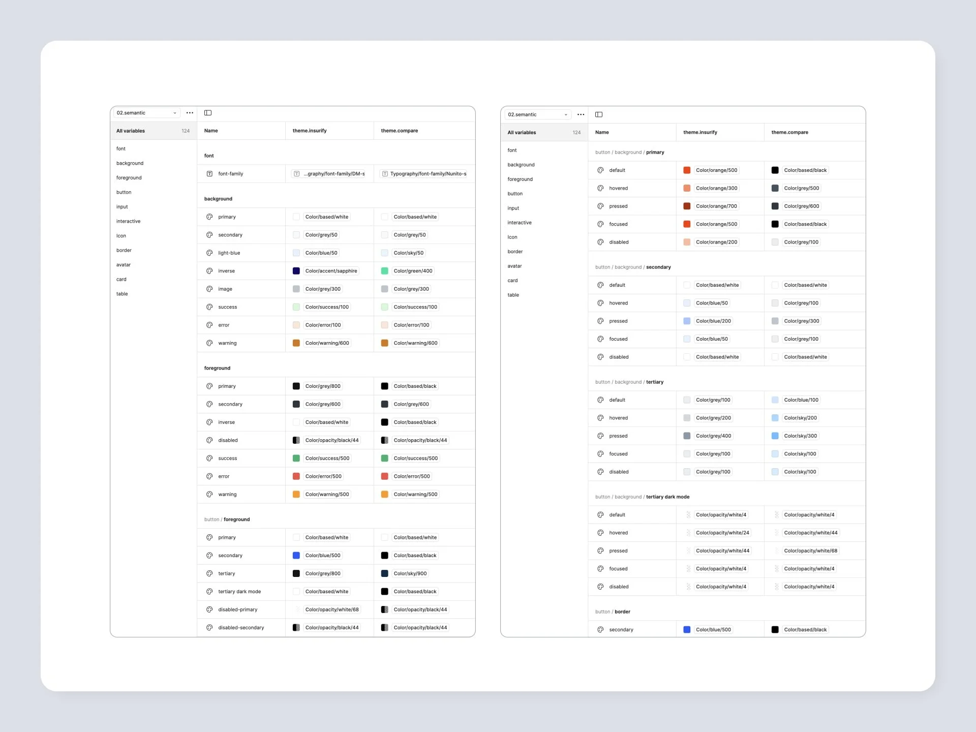
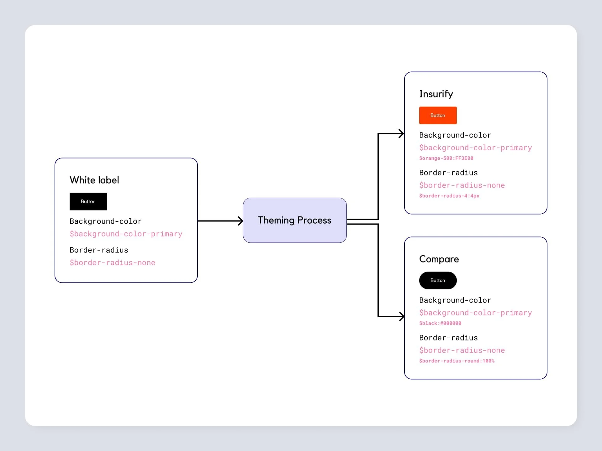
Design tokens abstracted style properties (color, typography, spacing), making it easy to apply brand-specific styles to shared components.Create a Modular Architecture
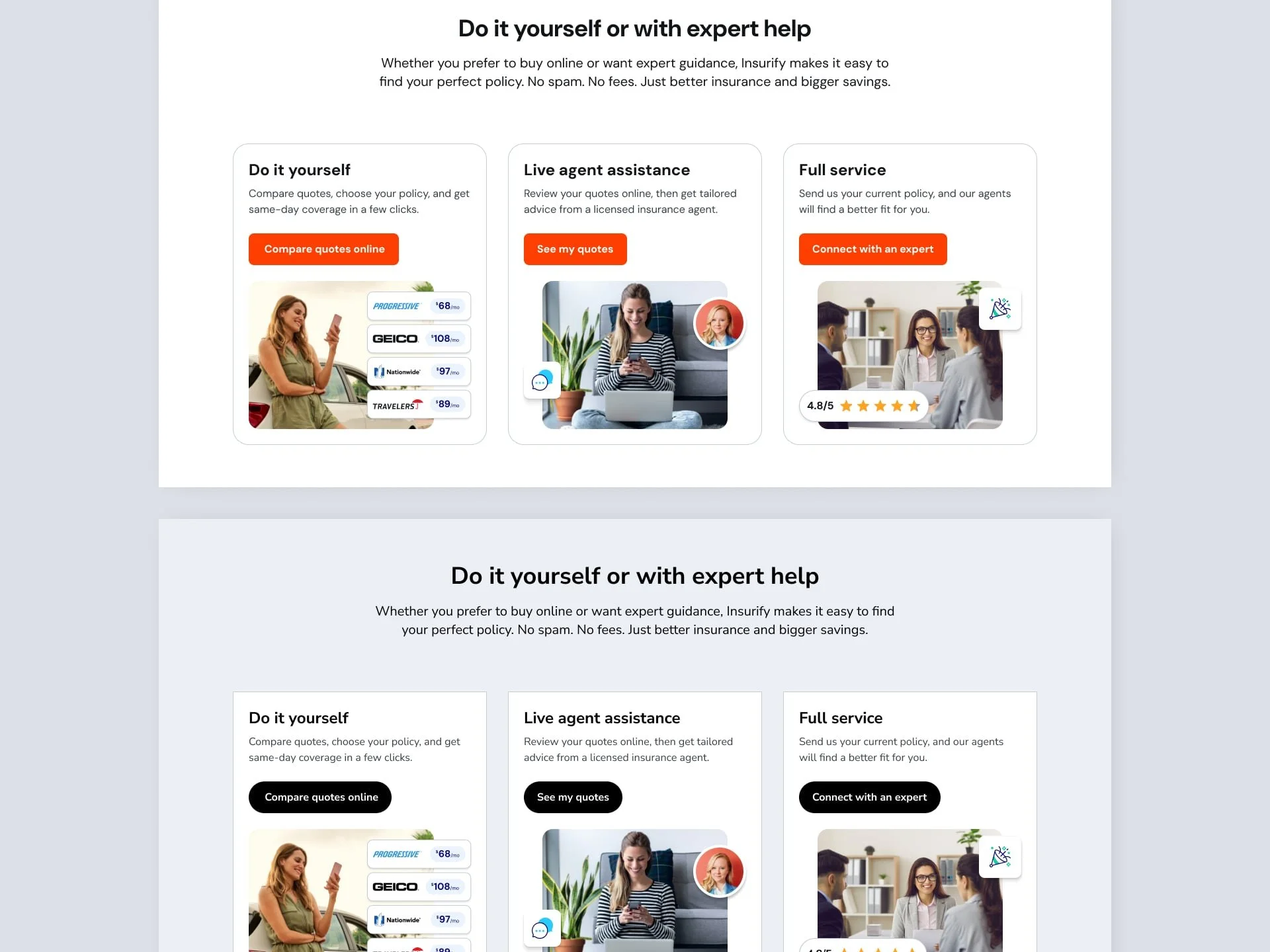
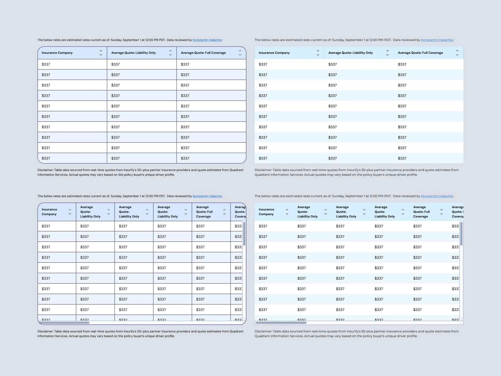
We structured components for override-ready flexibility, so Compare.com could have its own look without reinventing the wheel.Empower Teams with Tools and Docs
We built centralized libraries in Figma, reusable templates, and clear developer docs—turning a few creators into many.Collaborate Early and Often
Weekly syncs and shared KPIs aligned product, design, and engineering around speed, quality, and scalability.
Research & Insights
✅ Minimum Viable System, Maximum Value
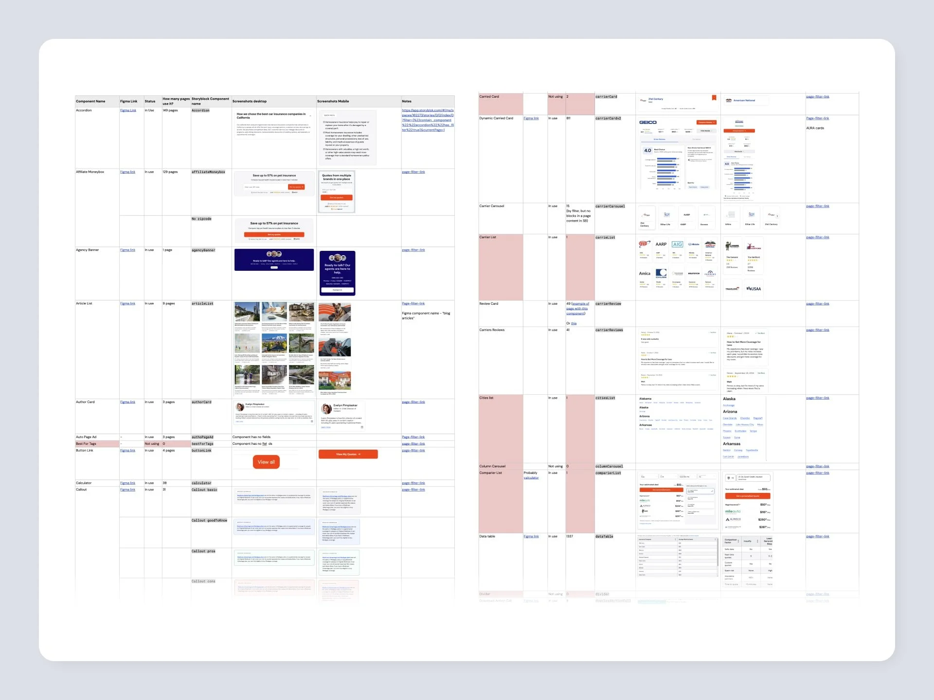
Audited both brands to identify core overlaps
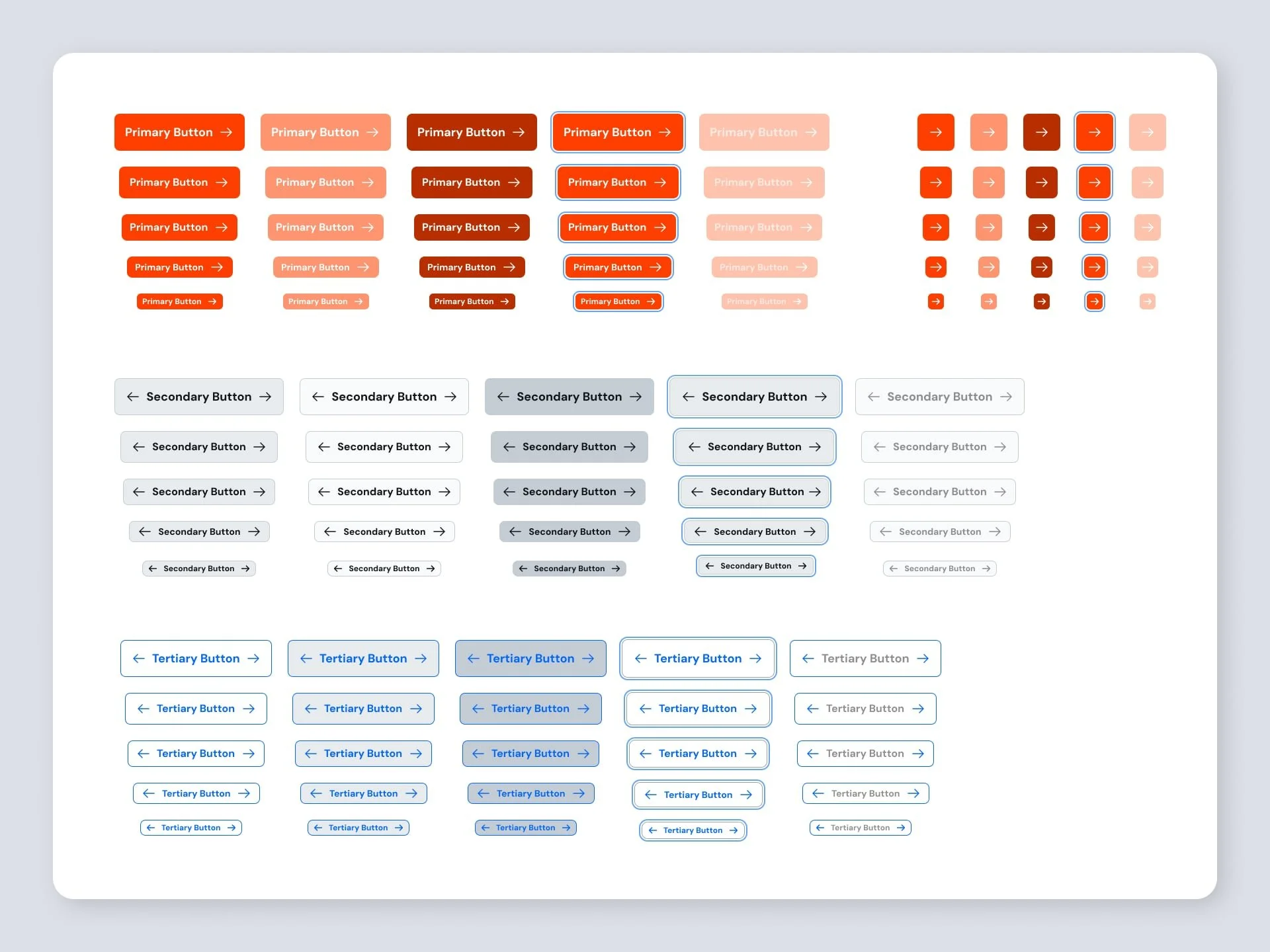
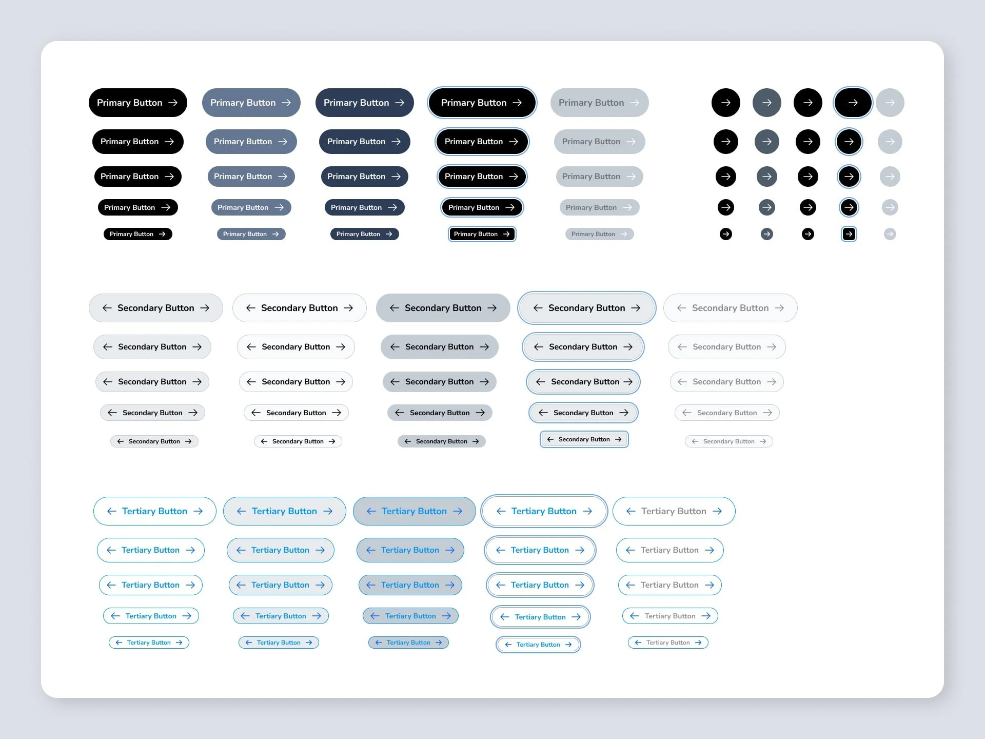
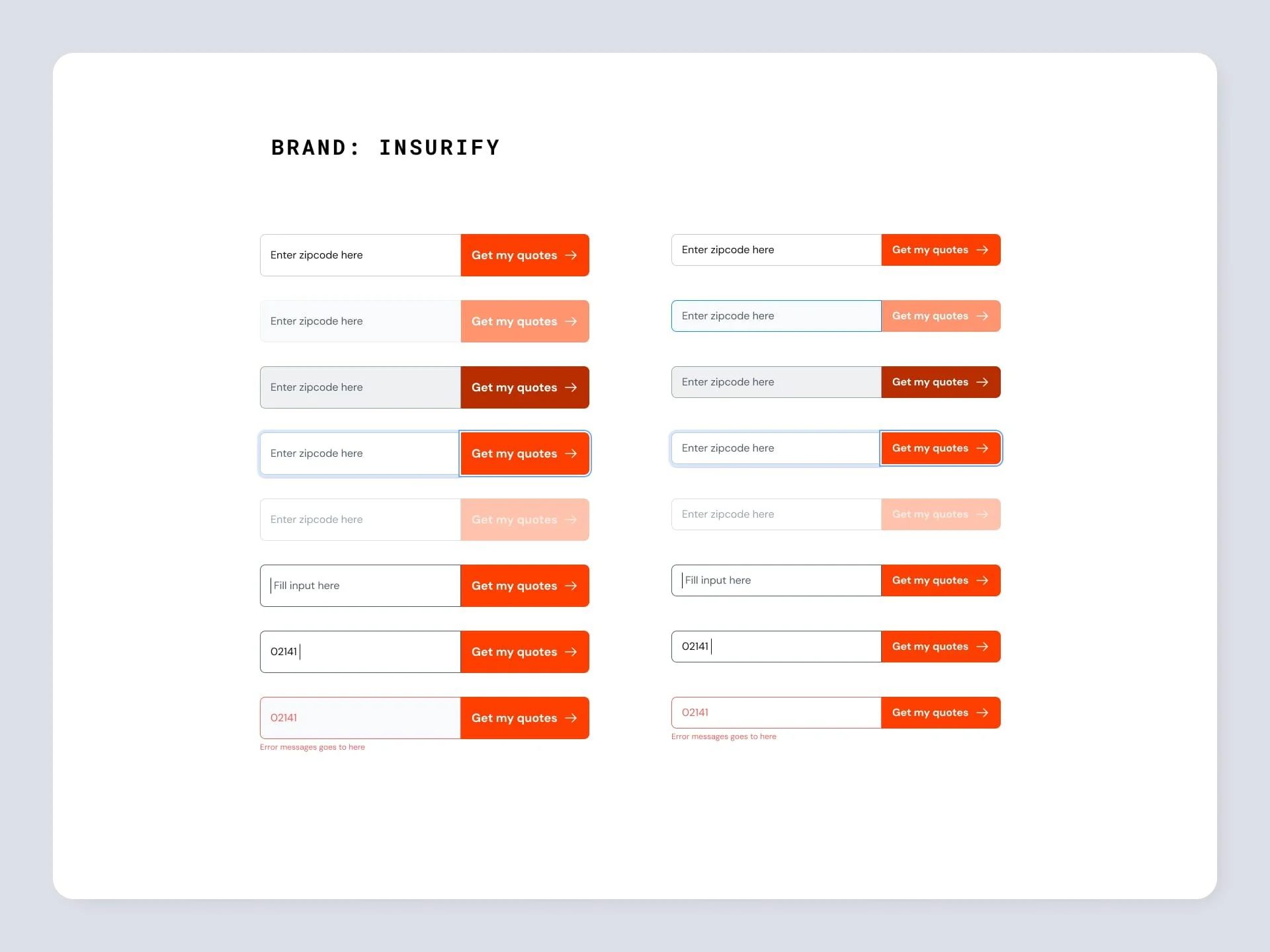
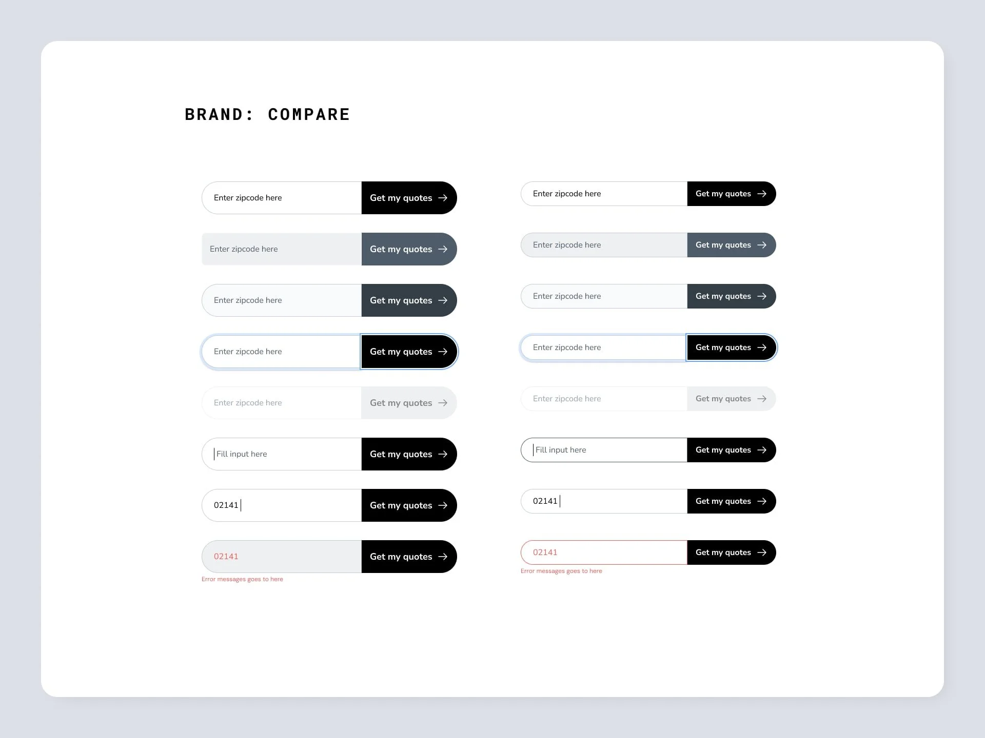
Prioritized high-use components: buttons, forms, headers
Delivered an MVP system that addressed 80% of immediate needs
✅ Design Tokens for Brand Flexibility
Tokens handled colors, typography, spacing
Enabled shared components (e.g., cards, modals) to flex per brand
Allowed fast onboarding of future brand themes
✅ Modular, Scalable Architecture
Built a theming structure for brand-specific overrides
Maintained a 70% shared component base
Supported unique visual styles without duplication
✅ Self-Serve, Self-Sustaining
Figma design libraries as a single source of truth
Templates + style guides for non-designers
Dev documentation to enable easy customization
✅ Cross-Functional Alignment
Weekly syncs with product and engineering
Shared KPIs to measure adoption and impact
Live training to onboard teams quickly
Outcomes
We launched the MVP in just four months, enabling faster, more consistent product delivery across two brands—without bloating design or dev pipelines.
Timeline: 7 months (including scaling and refinement)
Stakeholders: Eng Manager, 3 Full-stack Engineers, 1 Product Designer
Figma Link: (share during interview or portfolio walkthrough)